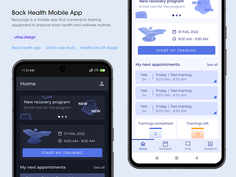
How we did a back health mobile app UX/UI design
ReLounge is a mobile app that connects to training equipment to improve back health and wellness routines.
Challenge
The main challenge was to create a user-friendly and engaging app. It was a hard task as the app should connect to the ReLounge device. The app helps people improve their back health. It has back exercises and keeps users motivated. It tracks progress. Users can set goals and get feedback.
Result
We have created an app that focuses on what users need and want. We achieved a simple and easy-to-use interface. The app motivates users with rewards and the option to share achievements. Our goal with the UX design was to make the training experience smooth and enjoyable. It included instant feedback and options that change to fit each user’s exercise path.
Numbers
97 Ease of use score
100% Design-to-code success
85+ Screens made
2 months Launch time
+92% User retention
Description
The ReLounge mobile app is a super user-friendly tool that connects with your back training equipment. This app helps personalize and enjoy back health. Users can easily track their progress with personalized tips. It provides meditation to enjoy all processes.
Dashboard
The Dashboard displays workout history, progress, and deals to keep users motivated and informed.
Problem
ReLounge app users find it hard to keep track of their workout history, progress, and special deals. They can’t see the big picture of their fitness journey because this information isn’t in one place. This lack of visibility can decrease their motivation to continue with their workouts.
Solution
The Dashboard shows progress charts and a list of deals. Users can easily see their progress and get excited about it. They can also make sure they don’t miss any cool offers. Users can see all their past workouts, track their progress, and access any promo codes they have, all in one place.
Schedule
The Schedule feature simplifies planning, lets users manage workouts, and sends helpful reminders.
Problem
Users of the ReLounge app often find it challenging to plan and keep track of their training sessions. Without a clear and easy way to schedule their exercises, they may miss sessions. They may also feel overwhelmed by trying to remember and organize their appointments.won’t be smooth.
Solution
This feature allows users to easily set up and view their sessions for the week or month. It’s designed with simplicity in mind – users can add, edit, or remove workouts with just a few taps. The Schedule feature also sends reminders to keep users on track.resources and schedules. Users can keep an eye on how their projects are doing and focus on their work and data analysis aims.
Training
Clear device functions and timers make training efficient and informative.
Problem
Users of the ReLounge app were unsure about how to use their training device. They were also unsure about how long their workouts should be. Additionally, they were unsure about the benefits they were getting for their back.
Solution
It shows the device’s functions clearly. It also has a countdown timer for the end and shows results. We made the design clean and user-friendly. Now, users can see at a glance what the device is doing. They can also see how long to train and how it’s helping them. This makes their workout experience both efficient and informative.
Meditation
Users can start customized meditations with a tap to enhance their training and focus.
Problem
People who use the ReLounge app weren’t sure how to combine meditation with their back training exercises. They needed a simple way to include meditation in their workouts to improve their overall back health.
Solution
Now users can start a meditation with just a tap, even during a workout. The meditations are customized to match the physical exercises. This helps users relax and focus, which improves their training.
Analytics
Clear charts and graphs make it easy to track progress and evaluate exercise effectiveness.
Problem
People using the ReLounge app were having a hard time making sense of all the training data. They needed a simple way to see how well they were doing with their back exercises.
Solution
Analytics display workout information in easy-to-understand charts and graphs. Users can easily see their progress and determine the most effective exercises. Users can track their workout frequency. The design is simple and user-friendly, so anyone can quickly assess their progress.
Thanks!
If you want to collaborate with us, feel free to leave us a message:
Website: uitop.design
Linkedin: Uitop
Email: intro@uitop.design
Phone: +1 716 941 7800


