Post_8 UX Correction in Glassdoor's Review Submission Page
Glassdoor is an online source of information for potential employees applying for jobs to do a background check for the companies and jobs they are applying for. But it is not only limited to that here the employers and companies also come to post jobs, respond to reviews and track insights.
(Source: Glassdoor)
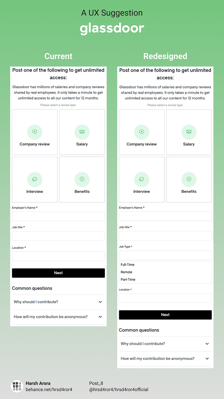
In Glassdoor, when you look up for reviews, the platform asks you to offer them information about your current or previous information such as:
➡ Company Review
➡ Salary
➡ Interview
➡ Benefits
Submitting this information helps potential people to get help from this knowledge base while looking for a job.
But when they are taking this information, the information might not be enough as they are collecting only:
➡ Job Role
➡ Organization
➡ Location
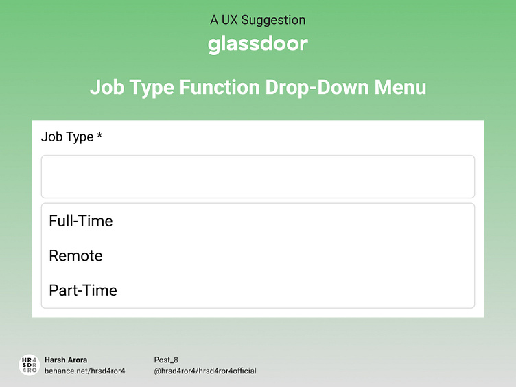
They should also add "Job Type" as a part of my information (Maybe they might be offering this option in the profile option or somewhere). It is because if I mention my location then that might be Mumbai/Bengaluru and the fact is that I have been working as a Work From Home employee in those companies.
So to solve this problem, I have added a UX suggestion in terms of design for Glassdoor to introduce it if they consider it to be important.