RIKI'S BAKERY | LOGO DESIGN & BRAND IDENTITY
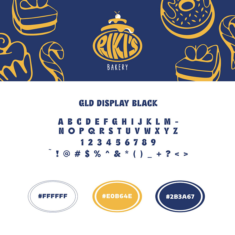
The logo design for Riki's Bakery features deep blue and yellow as the primary colors, with a touch of white. The highlight of the logo is an image of a cake topped with cream and a cherry, clearly showcasing the bakery's main product. The image of the cake with cream dripping down and a cherry on top not only symbolizes deliciousness but also reminds us of the meticulous attention to detail.
The word "RIKI'S" is designed in a handwritten style with curved lines, while "BAKERY" is written in a straight, simple font, creating balance and readability. The combination of these two font styles brings harmony to the logo.
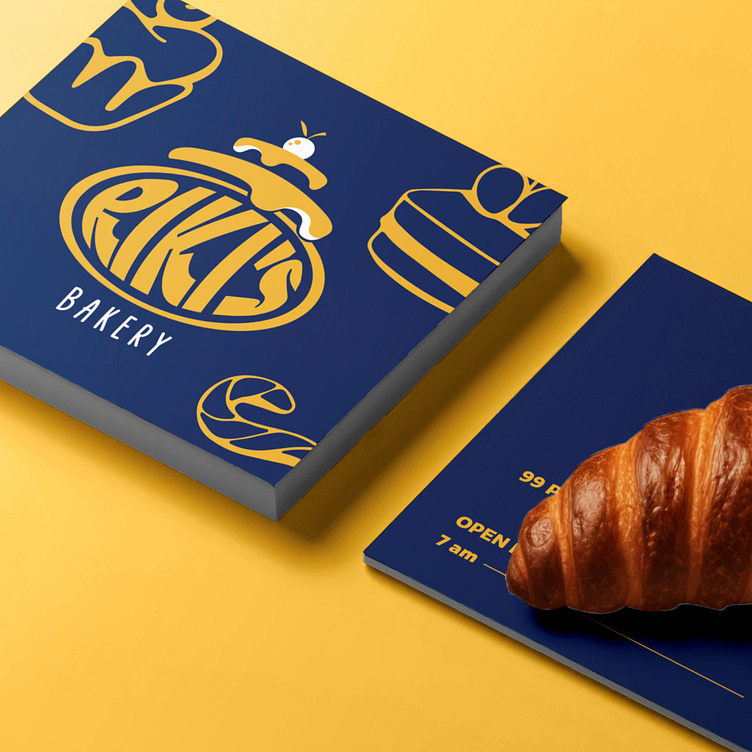
Overall, the logo of Riki's Bakery is not just a brand identifier but also tells a story of dedication and passion in every cake. This design will surely leave a lasting impression on customers and help the brand stand out in a competitive market.
Designed by Bee Art
-
Client RiKi's Bakery
Logo Design Project. Logo is designed for Bakery.
Copyright© Bee Art. All Right Reserved
Contact us:
• Hotline/ Zalo: (+84) 77 34567 18
• Email: info@beeart.vn
• Website: www.beeart.vn
• Facebook: https://www.facebook.com/BeeArt.vn