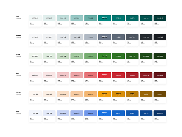
Color accessibility tests
Results of extensive accessibility tests conducted to develop a color palette that meets accessible contrast ratio guidelines. This 10-shade palette is designed for optimal accessibility: the first five shades are tested to pass against a dark color, while the latter five shades are tested to pass against a light color. This ensures an inclusive and user-friendly experience for everyone.
Stay tuned for more updates as I continue to explore and enhance accessible design practices in design systems!
More by Telmo Julião View profile
Like
