How I Designed FoodiePop Address Entry Page
Overview: FoodiePop is an innovative mobile application designed to showcase the most popular meals ordered within a selected region**. It enables users to quickly place orders, enhancing their culinary experience by providing easy access to trending dishes. As part of the ongoing development, an address entry form was designed to streamline the ordering process. This form leverages dropdown menus and input fields to reduce the need for extensive manual data entry, aiming for a balance between usability and efficiency.
** For other parts of the application, you can visit the links below:
Design Process and Decisions:
Journey and Workflow:
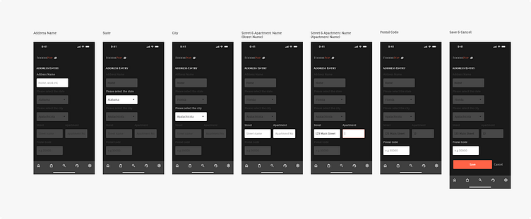
The address entry process is segmented into multiple steps, visually represented by screens 1 through 7.
Each step highlights the active input field while keeping the previous and subsequent steps visible but less prominent. This approach helps users understand their progress and anticipate the next steps without feeling overwhelmed.
Screen-by-Screen Breakdown:
Screen 1: Introduction to the address entry form with the first input field for the address name.
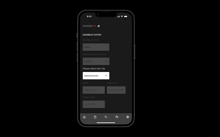
Screen 2-3: Users select their state and city from a dropdown menu, promoting consistency and reducing typing errors.
Screen 4: Street name and apartment number fields appear, allowing users to enter specific details about their location.
Screen 5: Continuation of street and apartment number input, ensuring clarity and focus on the current task.
Screen 6: Postal code input field, guiding users to complete the final step of the address entry.
Screen 7: Confirmation screen with a success message, providing closure to the process.
UI/UX Design Considerations:
Usability: By using dropdown menus for state and city, the design minimizes user effort and potential errors, enhancing the overall experience.
Accessibility: Large touch targets and clear labels ensure that users of all abilities can navigate and complete the form easily.
Visual Hierarchy: The current step is highlighted with higher opacity, while other steps remain visible but less distracting, maintaining user focus.
Feedback: Immediate visual feedback is provided at each step, culminating in a confirmation message upon successful address entry.
User Experience Enhancements:
Guidance: Each screen provides clear instructions, and placeholders within input fields offer examples, aiding users in understanding the required information.
Efficiency: The combination of dropdown menus and input fields strikes a balance between reducing manual entry and allowing customization, making the process quick and straightforward.
#FoodDelivery #MobileAppDesign #UIUX #UserExperience #AddressForm #AppDevelopment #MobileUX #UserInterface #DesignThinking #Accessibility #UserJourney #AppDesign #InteractionDesign #Usability #DigitalDesign #UIX101 #UI 082
