Redesign of smart™ Media / Public Relations Page
As a UX/UI Designer at smart™, I had the exciting opportunity to redesign the Media & PR site.
I started by thoroughly evaluating the design of various pages, identifying outdated components that needed an update. I then adjusted these elements to align with our new 2024 brand and corporate identity, incorporating our latest web standards and design trends.
To streamline the development process, I used yellow annotation cards to clearly outline the necessary changes for each component, ensuring effective communication with the development team.
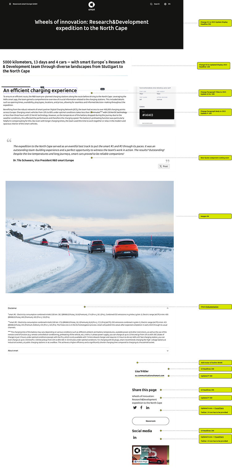
Below, you can see the inital state of the Blog Page design with developer annotations.
Old Blog Page Design
Upon analysis, I found the hero section’s black background unappealing. The typography, spacing, and positioning of elements were not optimized for a pleasant and engaging reading experience.
Blog Page Redesign
I replaced the black hero background with a full-screen image, making the page visually striking. By updating the typography, spacing, and positioning of elements, I improved readability and overall desirabilty. I also redesigned the sidebar panel and added a download section at the request of the business owner. Additionally, I included a related articles section to enhance user navigation and encourage longer site visits.

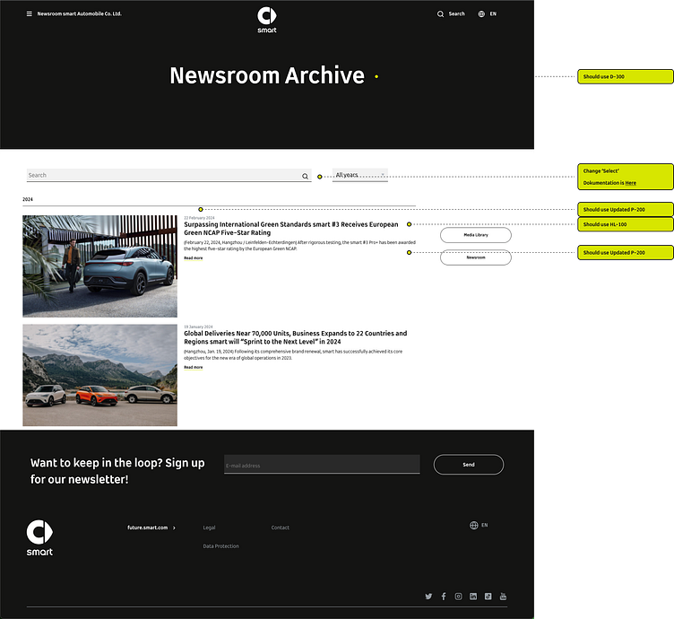
Old Blog Overview Page
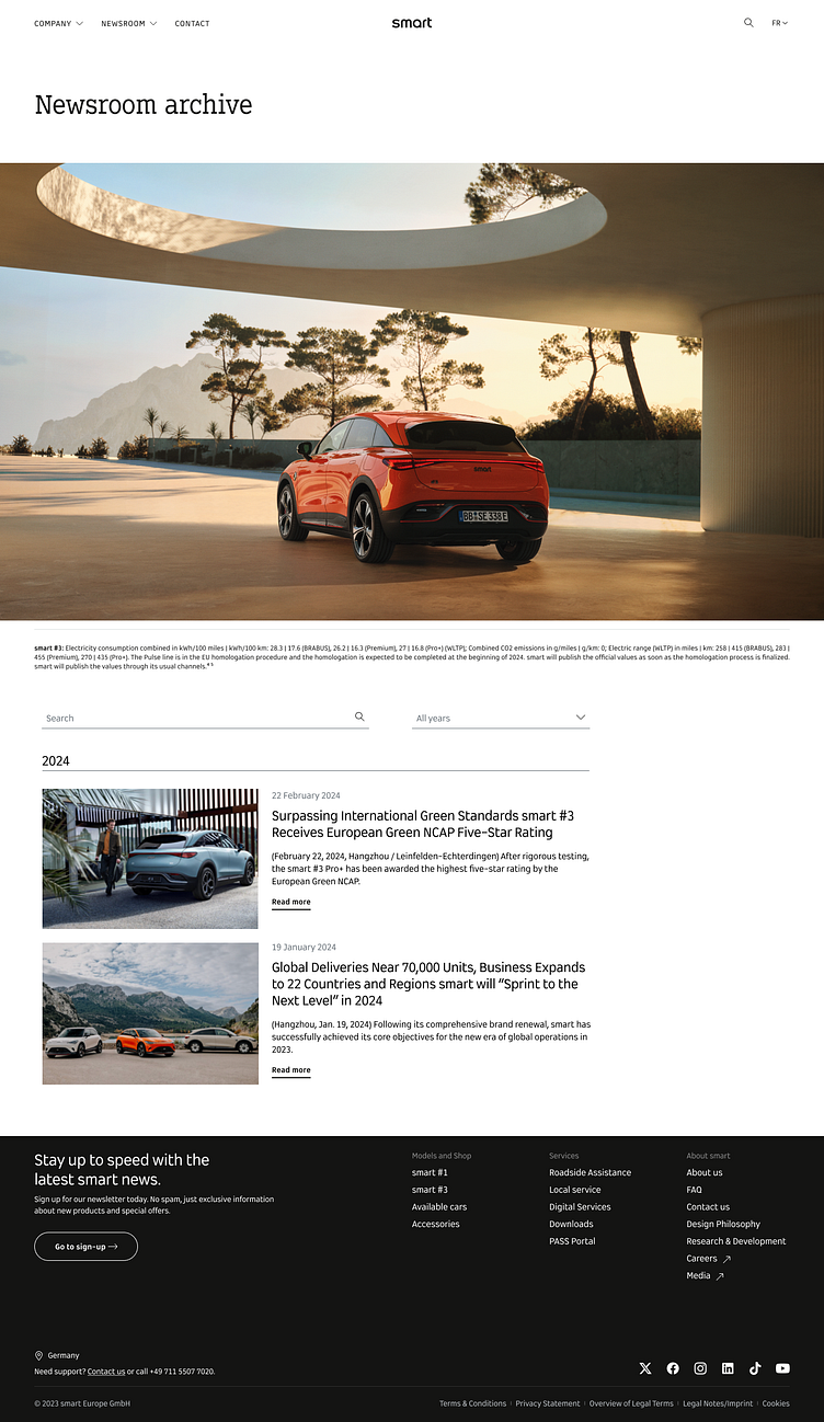
Blog Overview Page Redesign
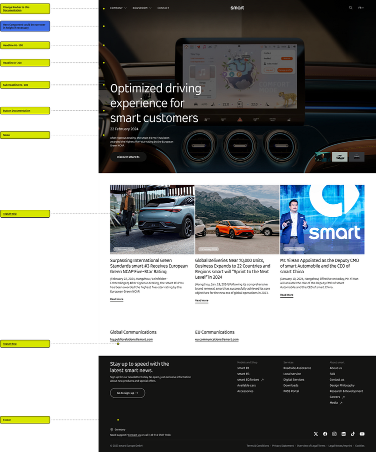
Finally, the Blog Homepage
The blog homepage originally appeared busy and cluttered.
The Hero Section’s minimal use of gradients made the text difficult to read, and the center alignment clashed with our updated left-aligned corporate design.
The tiles showcasing the latest articles had a dull black background, giving them an old-fashioned and unappealing look.
Furthermore, the author links were awkwardly stacked below each other, disrupting the overall flow of the page.
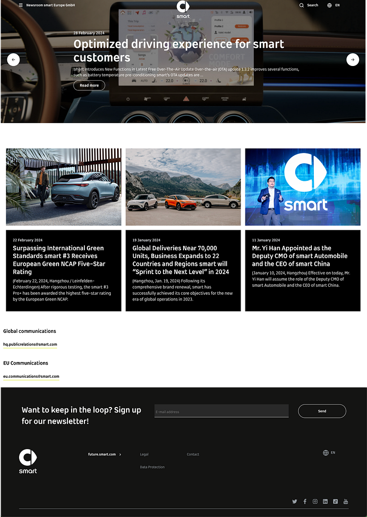
Blog Homepage Redesign
I enhanced the hero section by increasing its vertical space, making the image larger and allowing the typography to breathe. Adjusting the typography sizes created a clearer hierarchy between titles and subtext. To add interest and dynamism, I introduced a slider, making the homepage more engaging while effectively showcasing featured articles.
The latest articles tiles below the hero section received a modern refresh, with the removal of the black background, resulting in a more natural and appealing look.
Thank you for reading :)
