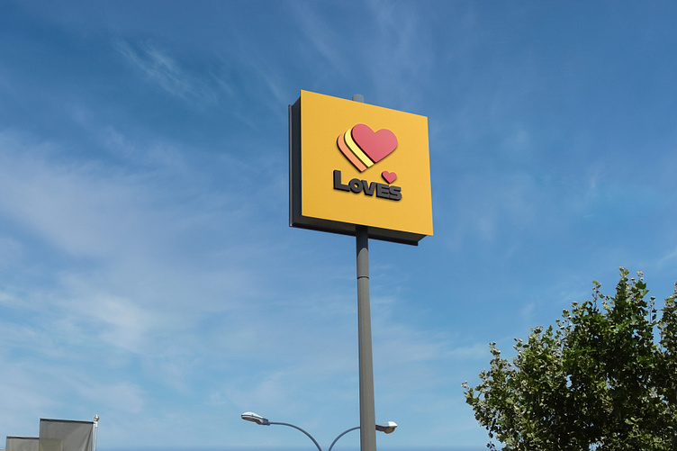
Loves Logo Redesign
I decided to test what a popular gas station would look like with a more timeless and minimalistic approach. Removing the black outlines with negative space and replacing the font with a more modern typeface will do the trick.
More by Carson Krause View profile
Like
