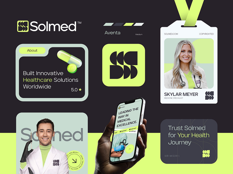
Solmed™ - Logo & Branding for a Medical Brand - S - Capsule
It was a big budget Logo and Brand identity design project for Solmed™. Just completed this project at the begaining of August! I personally Love this Logomark!
Solmed™ is a premier healthcare brand committed to excellence in medical services. They prioritize patient well-being through cutting-edge technology and compassionate care.
Concept: Letter S + Capsule + Medicine
Color Psychology: Green symbolizes health, renewal, and tranquility, making it ideal for healthcare brands. It evokes a sense of calm and healing, reassuring patients and promoting a sense of well-being. Green also reflects nature and growth, aligning with the healthcare industry's commitment to improving lives and fostering recovery.
Press "L" to show your love ❤️️
____________________________________________________________________
👉 Let's work together and elevate your brand!
📩 Available for new projects :
Email: info@rahidrehman.me
WhatsApp: https://wa.me/+8801705553455
Telegram: @rahiddesigner
💡 Follow for more update: Dribbble, Behance, Instagram, Twitter, Linkedin
© Rahid Rehman