Online Learning Website UI Redesign Light Mode
In this short short short project the goal is to redesign the course detail page of Kelas.Work. Kelas.Work is an online learning and teaching marketplace.
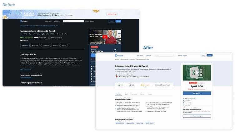
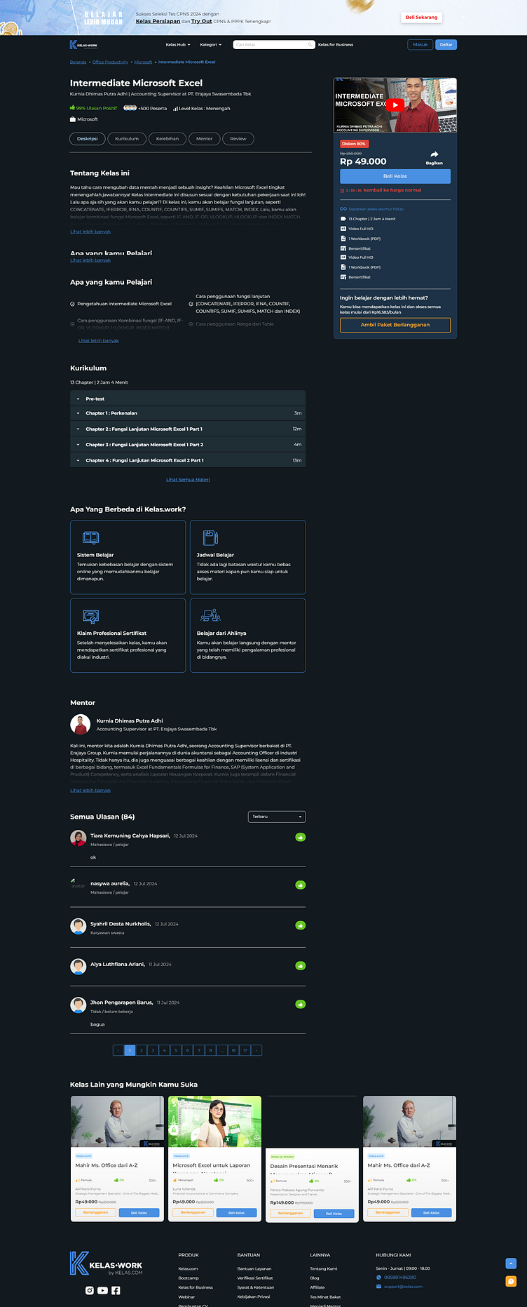
Kelas.Work has the default UI in dark theme whereas from the research I did shown that,
"The dark mode is ideal for reducing eye strain in low-light conditions and conserving battery power. It might also enhance focus and productivity, particularly for late-night workers. On the other hand, the light mode can improve reading comprehension, speed and might even foster creativity."
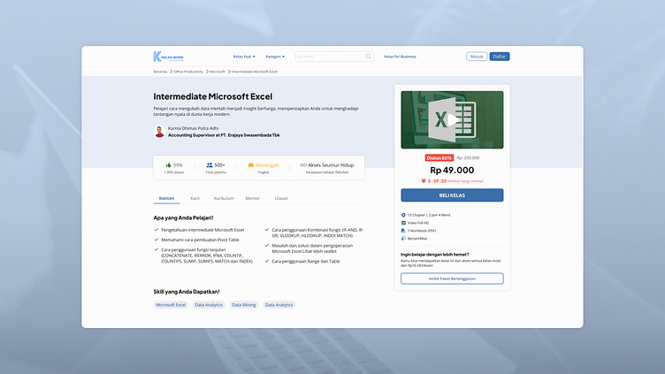
In the course detail page, the user goal is to make prospective buyers who visit be sure to buy the course from its interesting, brief, concise and clear information about the class they want to buy at Kelas.Work.
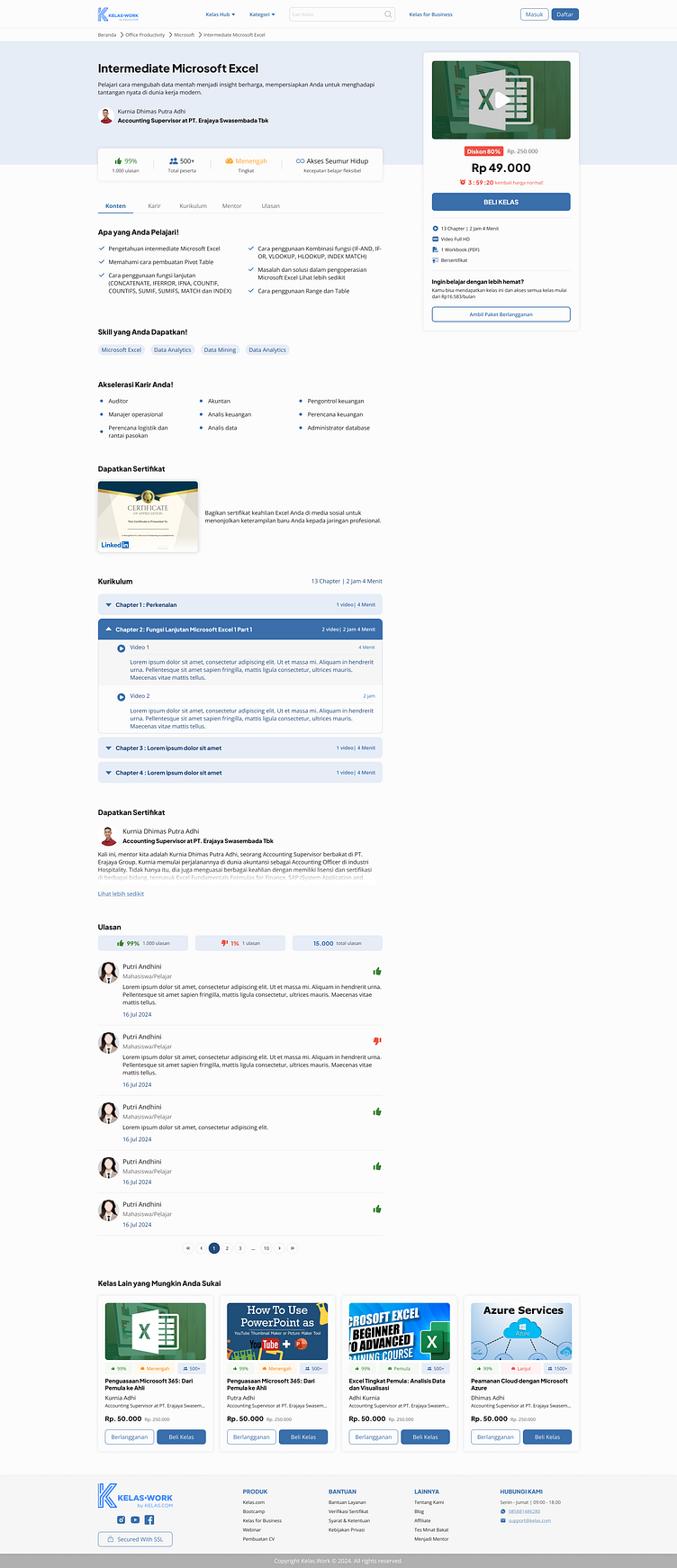
To make that happen, an easy-to-read page will help prospective buyers understand the course well and easily hence the light mode.
Before
After
Thank you for reading Dribbbler!👋
Don't forget to appreciate the press "L" if you like it! ❤️ and follow me 🙏
Get to know me more and contact me via email - qanitanadiaa@gmail.com
