Rebranding for investment company


Rebranding of the investment giant: How the human team updated QPartners
It is a challenging task to change the image of a company that is already a market leader. But this was the challenge we gladly accepted when QPartners, an investment giant with a long history, decided to update its brand and corporate identity.

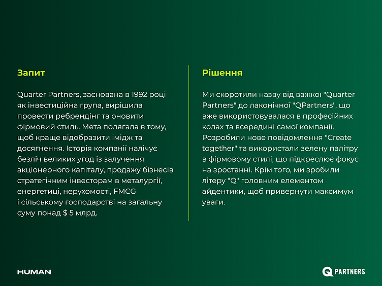
Quarter Partners, founded in 1992 as an investment group, decided to rebrand and update its corporate identity. The goal was to reflect the image and achievements of QPartners better. The company's history includes many large equity capital-raising transactions and the sale of businesses to strategic investors in the metals, energy, real estate, FMCG, and agriculture sectors for more than $5 billion.
Solution
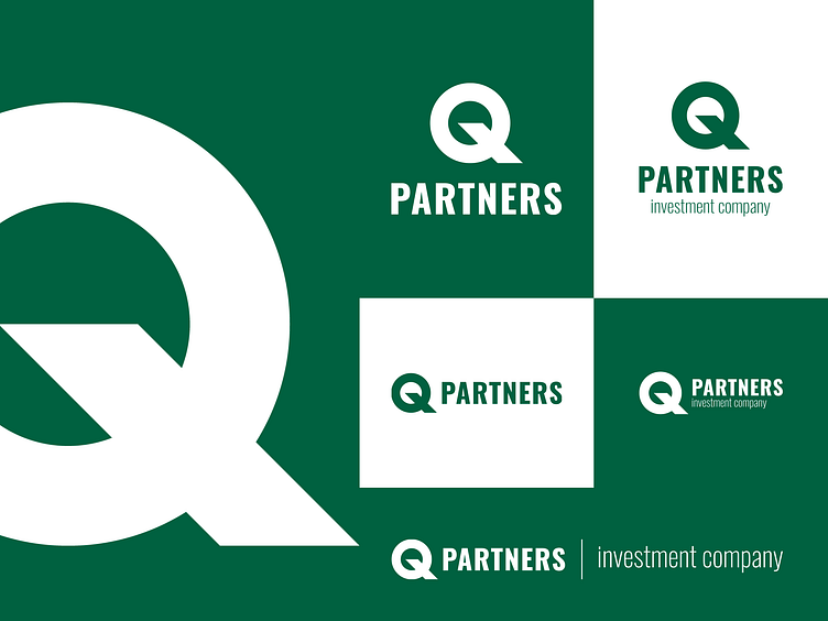
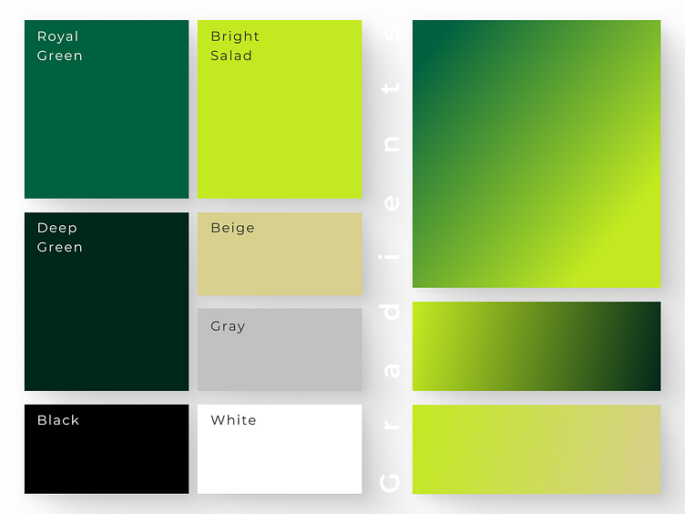
We shortened the name from the heavy "Quarter Partners" to the laconic "QPartners", which was already used in professional circles and within the company. We developed a new message "Create together" and used a green palette in the corporate identity to emphasize the focus on growth. In addition, we made the letter "Q" the main element of the identity to attract maximum attention.
Result
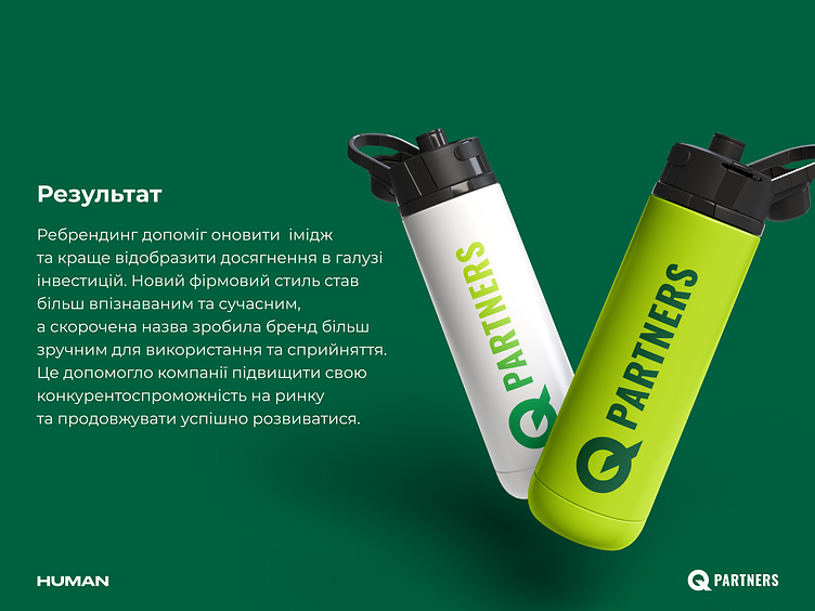
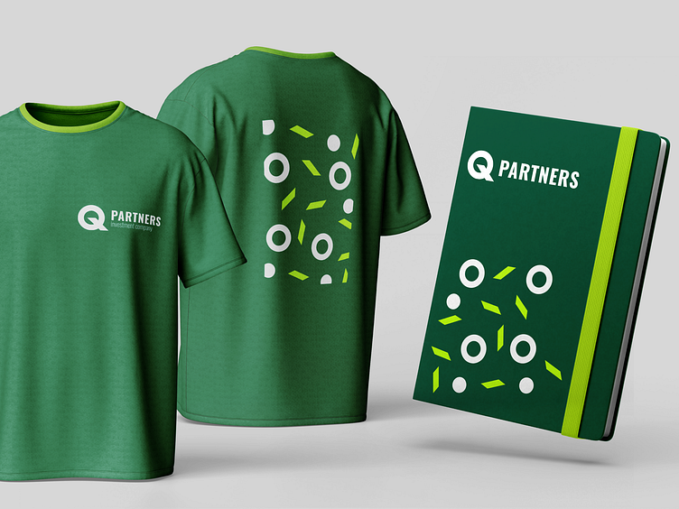
The rebranding helped QPartners update its image and better reflect its achievements in the investment industry. The new corporate identity has become more recognizable and modern, and the shortened name has made the brand easier to use and perceive. All of this helped the company to increase its competitiveness in the market and continue to develop successfully.