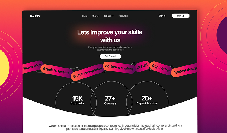
A Landing Page 🌟 Day 3 of My Daily UI Challenge! 🌟
I'm thrilled to share my latest design: a landing page for the startup RaLBW. 🚀💡 The goal was to create an engaging and informative landing page that clearly communicates RaLBW's value proposition and encourages user action.
Some Key Integrations:
Compelling Headline and Sub-headline: A strong headline to grab attention and a sub-headline that succinctly explains the startup’s unique offering.
Call-to-Action Buttons: Prominent and strategically placed buttons like "Get Started" to drive conversions.
Features Section: A clear and concise breakdown of the startup’s key features and benefits, supported by icons for visual appeal.
Courses Section: Detailed information about the courses offered, helping users understand the educational opportunities available.
Mentors Section: Profiles of experienced mentors associated with RaLBW, highlighting their expertise and role in guiding users.
Associated Companies: Information about companies partnered with RaLBW, adding credibility and showcasing collaborations.
User Testimonials: Social proof to build trust and credibility, showcasing positive feedback from early adopters.
Responsive Design: Ensuring an optimal viewing experience across all devices, from desktops to smartphones.
Clean and Modern Typography: Easy-to-read fonts that enhance readability and overall aesthetics.
Navigation Bar: Simple and intuitive navigation to help users easily find the information they need.
Check out the layout and features, and let me know your thoughts! Your feedback and critiques are always welcome as I continue this challenge!
#DailyUI #DesignChallenge #LandingPage #UIUXDesign #Day3


