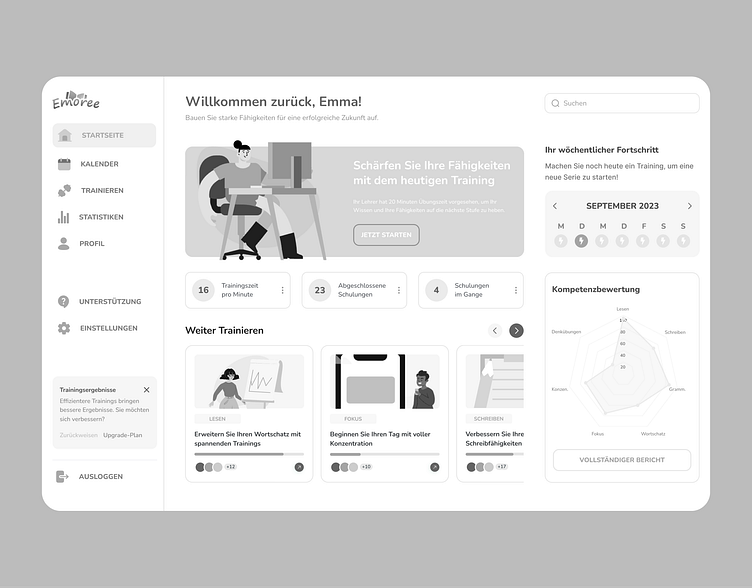
Dashboard Wireframe
Redesign of a Dashboard screen for Emoree platform.
The dashboard screen has been redesigned to have a side menu; several new pages have been added for Profile, Support and Settings, along with the box to upgrade a plan. At the top, there is a welcoming message and the main training box to motivate pupils and remind them of the goals set by the teacher. Underneath, there is another section showing the activity outcomes with three cards: outcomes, completed trainings, and trainings in progress. The next section includes scrollable cards of unfinished trainings. To the right, there is a calendar indicating activity days, and below it, a section on competencies with results.
The text has been rearranged for improved readability, and the layout makes a remarkable difference in clarity. The design has also changed to slim and modern looks, exposing the dashboard screen much fresher and cleaner. It now has modern appeal and everything one would want in the old ones and the trending dashboard features.

