E-commerce Platform Redesign
Project Overview
The objective of this project was to redesign the e-commerce platform for Nidecker, a renowned brand specializing in snowboarding equipment. The goal was to enhance user experience, streamline the purchase process, and align the visual identity with the brand's adventurous spirit.
1. Research & Discovery
To understand the pain points and opportunities for improvement, I began with thorough research:
User Interviews & Surveys: Conducted interviews with existing customers to gather insights into their shopping experiences.
Competitive Analysis: Analyzed competitors' websites to identify industry standards and innovative features.
Data Analysis: Reviewed analytics data to pinpoint drop-off points and areas where users spent the most time.
Key Findings
Users found the navigation cumbersome, product discovery challenging, and the checkout process lengthy. They also expressed a desire for a more visually engaging experience that reflects the thrill of snowboarding.
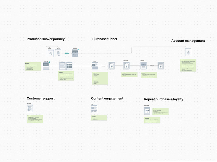
2. Defining the Problem
Based on the research, the primary challenges identified were:
Navigation Complexity: The previous design had a complicated menu system that made it difficult for users to find specific products.
Inconsistent Call-to-Action (CTA) Buttons: The old website featured multiple buttons with varying styles, which confused customers about the primary actions they should take.
Lack of Breadcrumb Navigation: The absence of breadcrumbs made it difficult for users to track their location within the site and navigate back to previous pages easily.
Inconsistent Banner Styles: Each banner had a different style, leading to a fragmented visual experience.
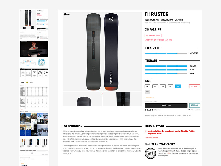
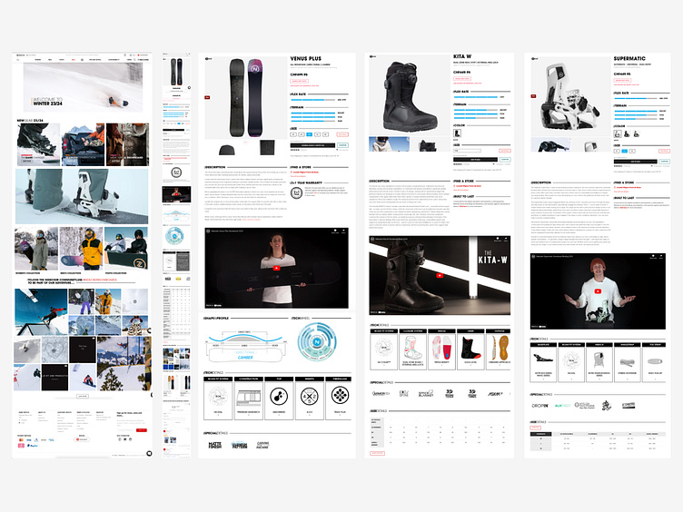
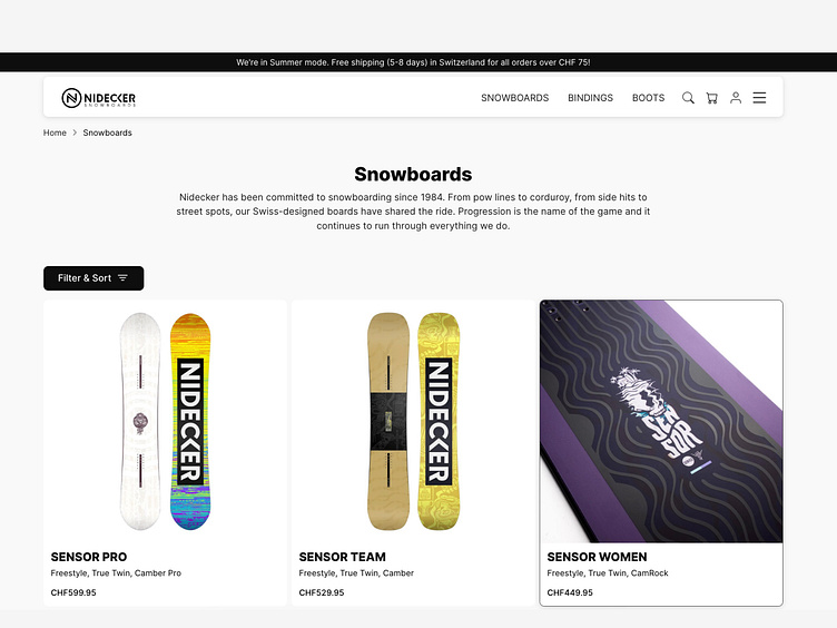
Product Presentation: Lack of visual consistency and engaging content for product displays.
Checkout Process: A multi-step checkout process that was not optimized for conversion.
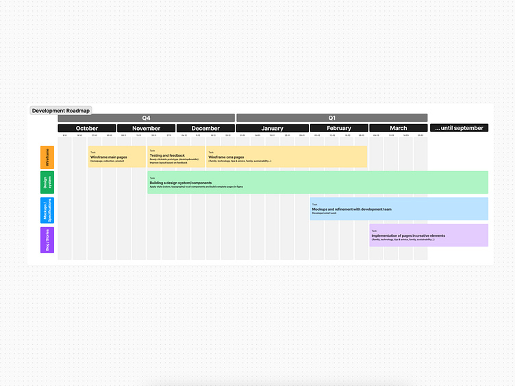
3. Ideation & Concept Development
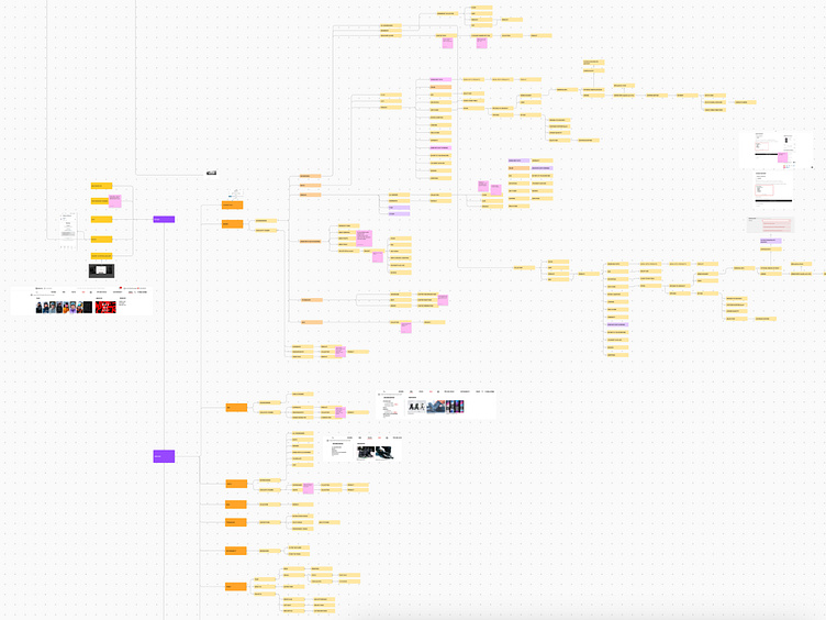
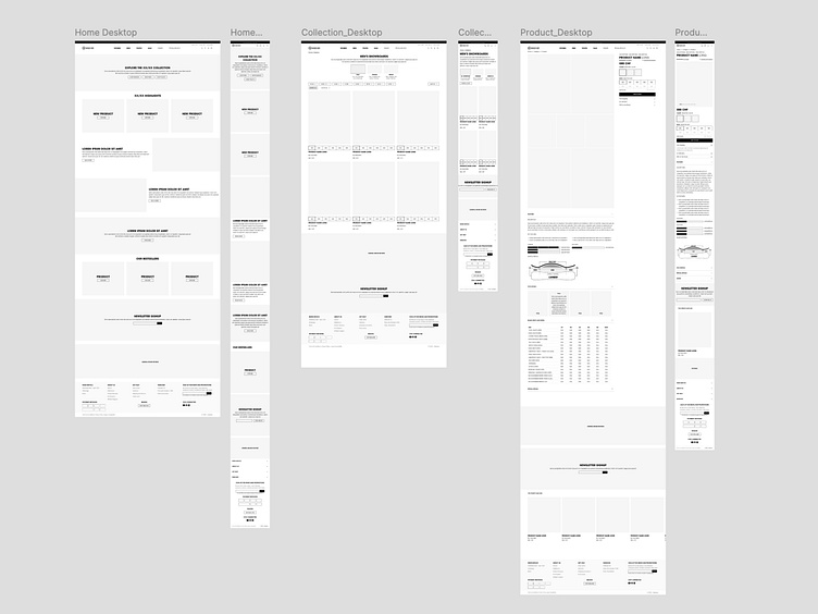
Wireframes and Prototypes
I sketched initial wireframes to outline a simplified navigation structure and a more intuitive layout. These wireframes were then transformed into interactive prototypes using Figma.
Design Principles
Simplicity: Streamlined navigation and clear categorization of products.
Visual Appeal: Bold visuals and immersive product displays to evoke the brand’s adventurous ethos.
Usability: A focus on mobile-first design to cater to the growing number of mobile users.
4. Design Execution
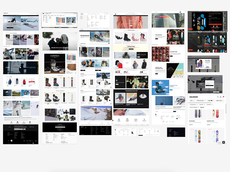
Visual Design
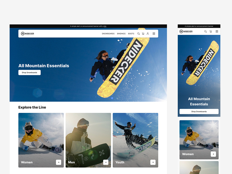
Color Scheme: The design utilized a palette of whites, grays, and blacks, evoking the clean, crisp feel of snow and mountains. Accents of bold colors were used for call-to-action buttons to draw attention and guide user interactions.
Typography: Clean, sans-serif fonts for readability and a modern aesthetic.
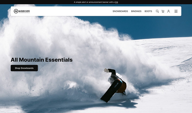
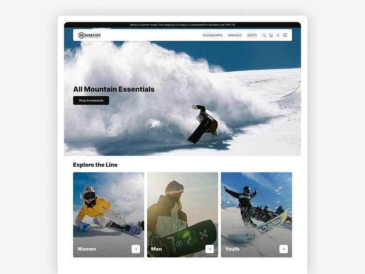
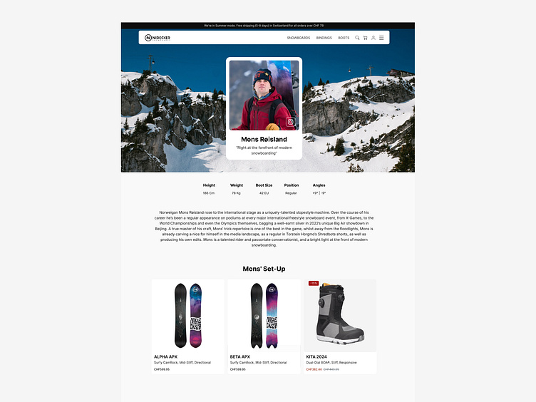
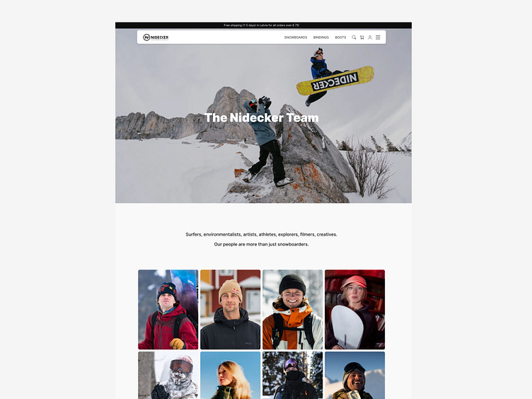
Imagery: High-quality, action-oriented imagery to showcase products in use, conveying the excitement of snowboarding.
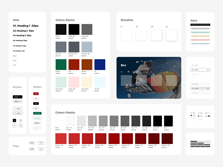
Design System
Comprehensive Design System: Developed a robust design system library from the ground up. This system included a full suite of reusable UI elements such as buttons, forms, modals, and navigation elements, each tailored to reflect Nidecker’s unique brand aesthetics.
Custom Components: Each component was custom-designed, taking into consideration usability principles and brand guidelines. The design system not only provided a unified look and feel across the platform but also facilitated efficient design and development workflows, ensuring that new features could be added seamlessly while maintaining visual consistency.
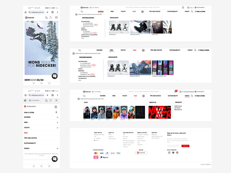
User Interface Implementation
Navigation: Simplified with a sticky header and a clear dropdown menu for easy access to product categories.
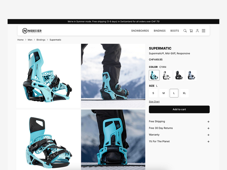
Product Pages: Enhanced with large, high-quality images, user reviews, and detailed product descriptions.
Checkout Process: Redesigned to be a single-page checkout with progress indicators and autofill options for faster completion.
5. Usability Testing & Iteration
After the initial design was completed, I conducted usability tests with a group of potential users. This helped identify minor usability issues and areas for further refinement.
Testing Feedback: Users appreciated the new streamlined design, found the navigation intuitive, and noted that the checkout process felt faster and more efficient.
Iterations: Based on feedback, adjustments were made to improve button placements and enhance accessibility features, such as contrast ratios and text sizes.
6. Final Design & Launch
The final design successfully addressed the initial challenges and aligned with Nidecker’s brand identity. The new platform offers an intuitive and visually engaging experience that encourages users to explore and purchase with ease.
Key Features:
Enhanced Product Discovery: Improved search and filter functionalities.
Seamless Mobile Experience: Fully responsive design ensuring usability across all devices.
Optimized Checkout: Streamlined process that minimizes cart abandonment.
Outcome & Reflection
The redesigned e-commerce platform received positive feedback from both users and stakeholders, resulting in increased user engagement and a noticeable boost in conversions. This project not only showcased my ability to enhance UX/UI but also deepened my understanding of user-centered design and e-commerce best practices.