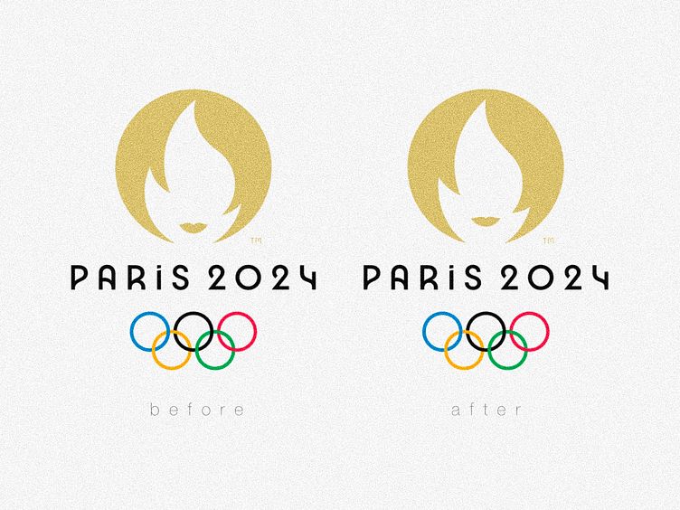
Paris 2024 ✦ Set point!
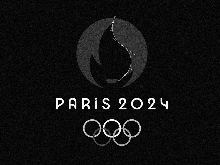
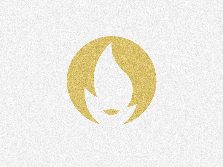
Something has been bothering me a lot every time I see the Paris 2024 Olympics logo, and once you see it it will be hard to unsee it.
And it is this big hair S-shaped curve that has some awkward break in the middle (when the curve change it side).
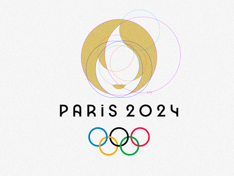
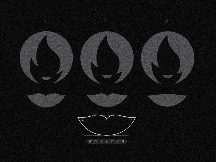
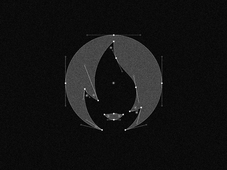
I imagine that this is due to the method of construction of the shape, I mean there’s 2 options: or they’ve done it using circular grids, would be a great way of use for the olympic rings in the process (lol)
But as far as I could try, the curve radius doesn’t quite match, so maybe they just connected over that lack of touch between both green rings?
Or maybe just a free pen tool work over a circular shape?
At first glance it may look simplier with just 3 anchor points, but the addional point will add a lot in fluidity and make the curve way smoother as you can see at the comparison slide.
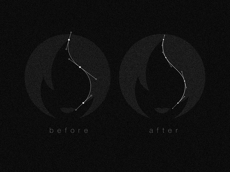
Well, there is some trick about designing curves on illustrator (just my experience here…), if you want to make the shape look smoother better add at leat 2 anchor points between the extremities.
That is basically what make me breath calmly, add an extra point to get rid of that awkward break that haunted me. Of course, once my Illustration session was already open I would not stop here…
So, in my ideal logo I would also change the following points:
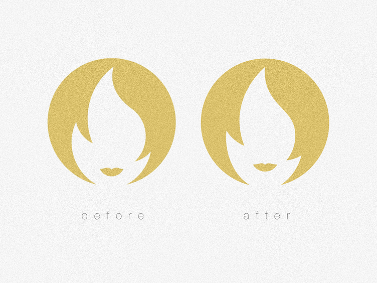
a) Lengthen the flame, I understand that this makes it more abstract, but since we are dealing with at least 3 images here I think it would be cool to balance them visually, and the round flame makes the face look like an anime or doll in a way, the elongated chin looks much better IMHO.
b) Balance the thickness of the strands of hair that are quite discrepant in the current logo, this also has to do with drawing the symbol better (just my opinion).
c) Raising the position of the mouth a little also helps to make it look more like a human face; since the whole head is already recognizable as a medal, the position of the mouth helps to make the face more adult; unless the idea was to make it look like a child or an anime, etc.
d) Reduce the noise in the mouth, this point is just an extra; I believe that this minimal detail in the upper part of the mouth adds little positive to the symbol; and removing it also adds the possibility of seeing it as a smile, in addition to reducing the number of points.
Anyway, that's what comes to mind and it's really relieving to get it out there lol; I hope these insights add something to you too.
It often costs very little to draw your symbols well, but unfortunately it's something that's little or not at all valued, which is a shame!
If you like my version of the logo (and quick study) please help sharing, let’s make this reach Pierre de Coubertin!
Also, I’m available for new projects :)
Don’t hesitate: get in touch by bitenquote@gmail.com
Feedback and suggestions are always appreciated!
Best,
BB