How I Redesigned Linkedin Status Update Part
Introduction
#LinkedIn is positioned as the center of professional networking and career development. Aiming to improve the platform's user experience, I undertook a redesign project focusing on the status updates feature. In this project, while preserving LinkedIn's minimalist design language, I aimed to provide users with a richer and more interactive experience.
Problem
The current LinkedIn status updates feature offers limited expression options to users and does not make the content creation process sufficiently flexible. In particular, users demand more customization and the ability to add visual elements.
Solution
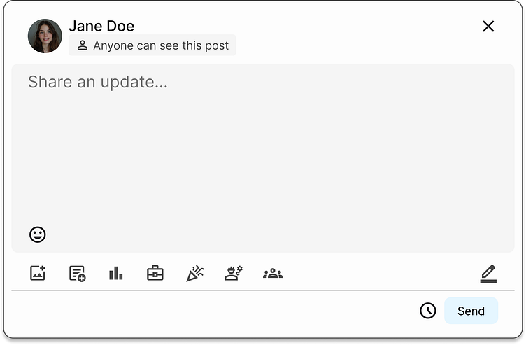
Edit Toolbar Feature: I added an edit toolbar that provides users with various editing options such as text formatting, list creation, and link insertion. This feature allows users to make their content more visual and engaging.
Color Palette: I maintained LinkedIn's existing blue color palette for design consistency. At the same time, I created visual depth by using different shades of blue.
Minimalist Design: I adopted a minimalist approach in line with the platform's overall design language. By removing unnecessary elements, I ensured that the user's focus remains on the content.
#UIUX #Design #LinkedIn #Redesign #UIX101 #UI 081 #Portfolio #DailyUI #DailyUIChallenge
