24/32 – Dakota Rhinos
Heed the Stampede
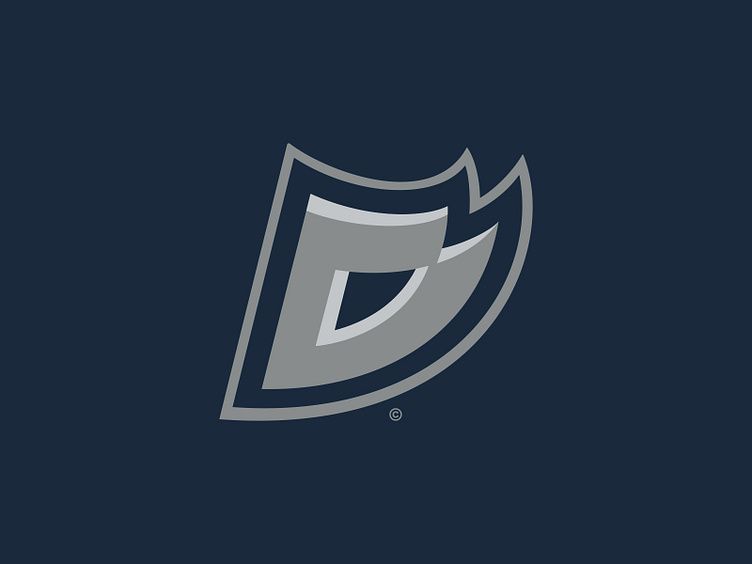
We wrap up the Northern Division with the Dakota Rhinos, the 24th team for #TheUFLProject.
The Dakota Rhinos have a top-5 brick wall of a defense and an aggressive play style on both sides of the ball that makes them to be a force to be reckoned with in the West Conference. This have made the playoffs in three straight seasons, including a number 1 seed in Season 25. In that playoff appearance however, their do-it-all QB proved too aggressive on a scramble and was lost for the game with an injury, leading to a first round exit after a 12-4 season. This head-of-steam mentality may be the reason for the Rhinos' success, but it could also be their downfall.
Visual Direction
The Rhinos are another one of the 20-year-old original franchises that have seen minimal changes if any at all. No – there isn't a deep significant connection between the Dakotas and the "Rhinos" team name, but the rhinoceros is a symbol for strength and determination – two great characteristics for a team on the gridiron.
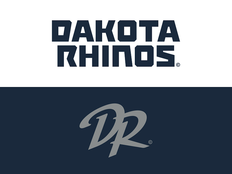
Technically, the Rhinos represent both of the Dakotas (see the Carolina Panthers) but in theory the team would call Sioux Falls, SD home – one of the fastest growing metropolitan areas of the Midwest. Visually speaking the team's identity leans in heavily to a navy and dark gray and even pulls inspiration from both the North Dakota and South Dakota welcome signs that use an energetic typographic style that the Rhinos use for their team wordmark.
Execution
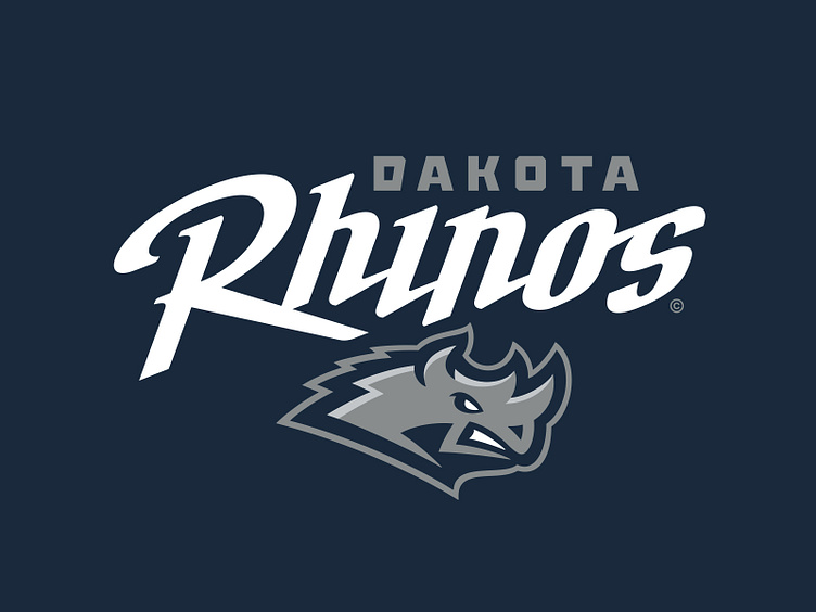
The primary logo for Dakota depicts a charging rhinoceros in gray with a snarling anthropomorphic expression that bears its teeth. This characteristic is retained and evolved from the original logo.
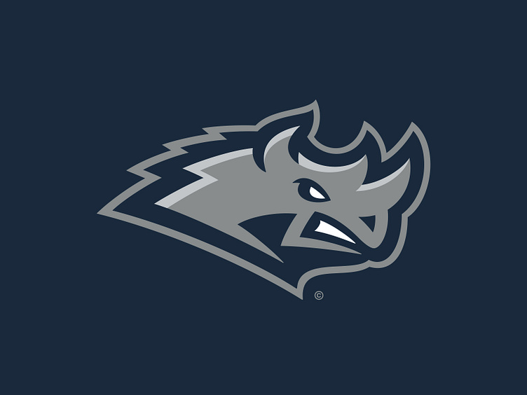
A secondary "horned D" logo is another legacy mark that has seen many iterations over the years. This logo borrows visual execution from the primary with the same shading and color structure to depict a "D" for "Dakota" with two rhinoceros horns.
In addition to the previously mentioned secondary, the Rhinos also have a "DR" monogram that is built from the dynamic team wordmark. This tertiary mark is delegated exclusively to team merchandising.
The Rhinos have two different typographic styles that are used for team wordmarks. The first is the aforementioned expressive variant inspired by the Dakota state signage that is designated as the main team wordmark. The second style is a brute-looking athletic block that includes several design cues that suggest a rhino-like appearance. This style includes both "Dakota" and "Rhinos" versions.
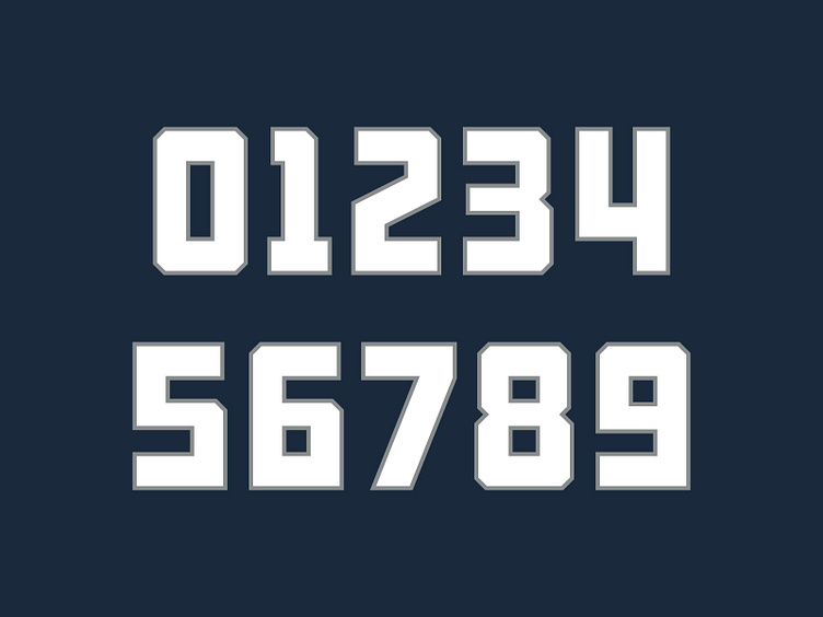
This brute athletic block is also carried over in to the team's jersey number set, materializing in to a classic and tough-looking execution.
Born to be Wild
The Dakota Rhinos look to stay on the rails as their quest for success is now accompanied by a strong visual identity and a robust graphic suite.
Football Helmet Mockup by SportsTemplates
____________________