5 Years Into Design...

I stumbled onto a design I did right as I was getting started in product design. And I thought it would be an interesting exercise to redesign it and see how I would make it better now.
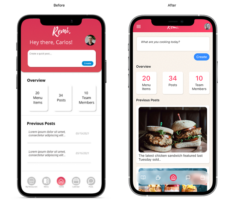
For context, I designed (and tried but failed building) an app for restaurants that could take their menu and create social media posts daily. This was supposed to be powered by AI (before AI was a thing, I was even given beta access to GPT 3.5, precursor of ChatGPT).
So in this screen, the dashboard, the goal was to present the user to create a social media menu based on a prompt, as the primary "job to be done" but also give an overview of the restaurant, number of posts, menu items etc. As well as a history of completed posts.
A few years later, here is what changed the most: 1) I am relying mostly on auto-layout to keep things neat and aligned. 2) Floating, glass-effect nav bars are my new thing. 3) Tried to keep things short and save vertical space. 4) Off-white and added texture backgrounds.
If I had given it more time, I'd probably still work on some the padding. Not loving the "create" button placement as well as the overview cards. I'd probably keep tinkering on this.
That's all✌️