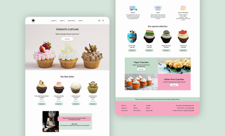
Redesign of Online Store Website
Hello there!
I will share the Redesign of Online Store Website.
Redesigning a website for an online cupcake store in Canada.Our team started the redesign by focusing on user experience aspects and we defined the task of purchasing cupcakes as a gift based on the user's favorite flavor.We have created an opportunity for users to send a voice message with their purchased cupcakes.
Problem Statement
Toronto Cupcake operates exclusively online and does not have any physical stores. However, the website could benefit from a redesign to enhance the shopping experience for customers. The current website lacks clarity in displaying its products and services, leading to an unsatisfactory customer experience.
Our Goals
Give users a friendly and authentic feeling when it comes to the website
Increase user satisfaction
Simplify the process of placing an order
Design accessible products
Design a user-friendly interface for the website
Our Approach
Heuristic evaluation of the website to discover the main usability issues and to get a better insight into what to focus on during the user research
Float surveys to understand why users avoid buying cupcakes online and what features or information they consider essential for an online cupcake store
Interviewed potential users to understand their concerns and needs
Competitive analysis to understand Toronto Cupcake's strengths and weaknesses
Hope you like it.
Thanks for your consideration.


