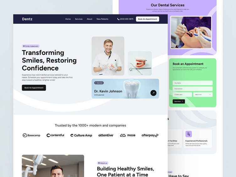
Dental Health Landing page
Hi Everyone!
Greetings from WhiteFrame creative
Presenting today’s design exploration by White Frame Creative
The landing page for a Dental Health Landing page must exude a strong visual appeal that reflects the agency's brand identity. This can be achieved through a clean and modern design, high-quality imagery of past projects, and a consistent color scheme that aligns with the agency's branding. Use of white space, minimalistic elements, and professional typography can enhance the page's elegance and sophistication.
Leave your thoughts in the comments below!
If you like what you see, don’t forget to leave a like ❤️
✨Preview✨
✨Full Previwe✨
WhiteFrame creative is a UIUX design and development agency based in Indonesia providing high-quality, personalized services for every client. We have helped various clients on their projects, solving their problems and increasing their values in their respective fields.
So, what are you waiting for?


