Messaging App iOS Concept
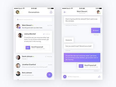
I wanted to put a little more work into my previous Messaging Chat App shot. I decided to focus a little more on the usability than before, spending some time solving the little problems.
One problem I encountered was a lot of chat apps have profile photos even when the conversation was between two people taking up space and being repeated for every message. Perhaps confusion as to who messages belonged too?
To get around this, on the list screen your profile is in the top left and in the conversation single view, your contacts photo is in the top right. So you always know your messages are on the left, and theirs are on the right.
I also looked at adding a 3D-touch message preview ability. Though at the moment I can't think of a way to actually tell the user this exists without being annoying.
Feedback and thoughts always welcome :)

