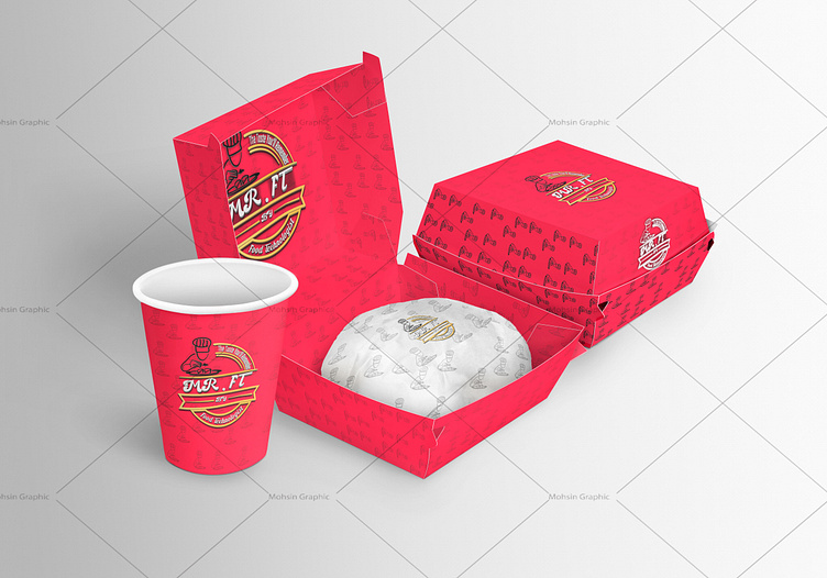
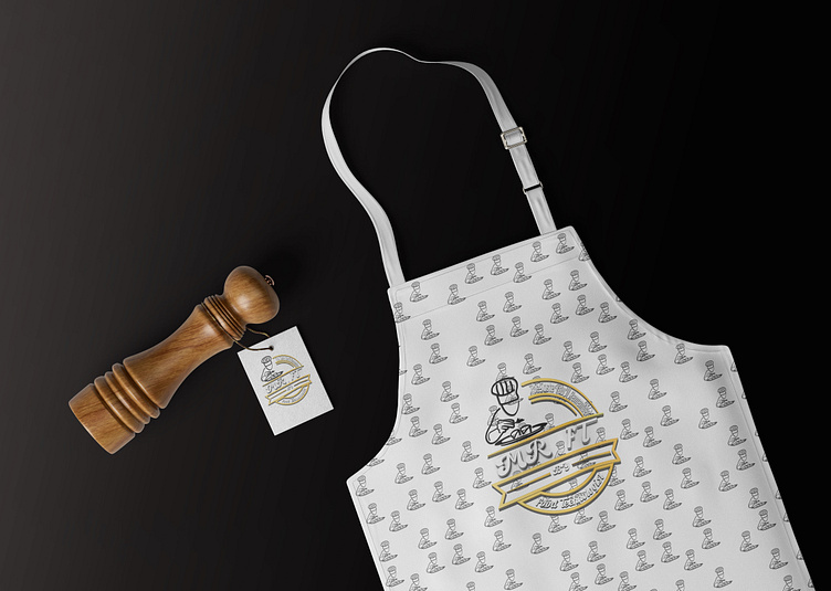
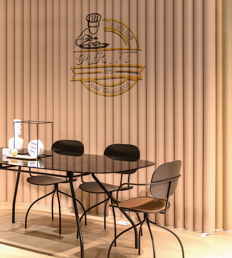
MR.FT by food Technology Logo Brand Identity
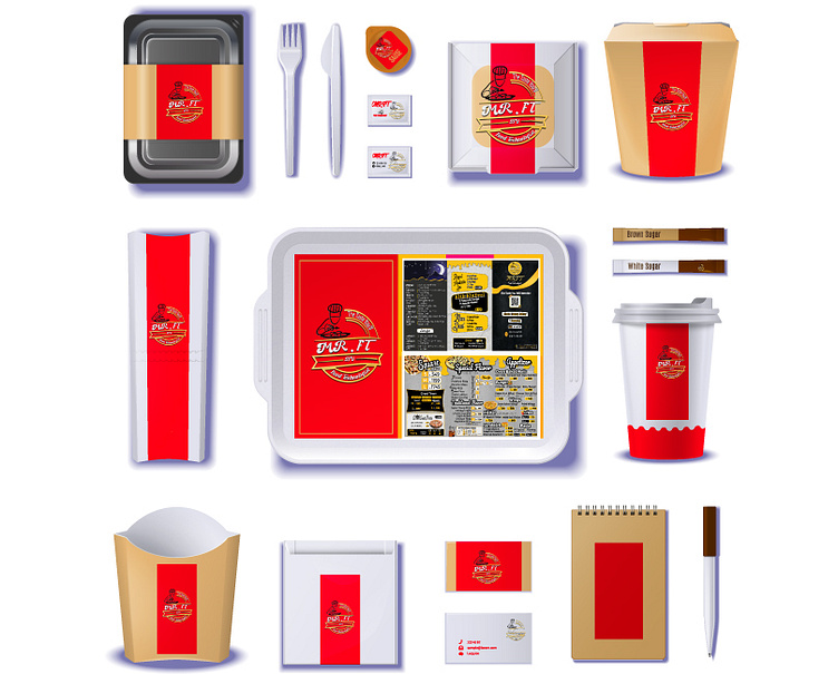
MR.FT working in food—a broad category that includes manufacturers of packaged foods, brick and mortar retailers, restaurants, food bloggers, food-related services.
Technology and Food Fusion:
circuit board pattern could symbolize the fusion of food and technology. This represents the innovative approach Mr. FT Food Technology brings to the industry.
Modern and Clean Lines:
advanced and forward-thinking nature of the brand.
Typography:
Bold and Clear Font
Choose a strong, serif font to convey reliability and innovation.
Use font be easily readable and convey a sense of professionalism.
Color Palette:
Yellow and dark yellow color,technology, trust, and professionalism. These colors together create a balanced and harmonious look that aligns with the brand's values.
Balanced and Symmetrical:
Ensure the logo is balanced and symmetrical to give a sense of stability and trustworthiness.
Tagline:
If a tagline is included, it should be concise and descriptive, such as "Innovating Food with Technology" to immediately convey the brand’s mission.
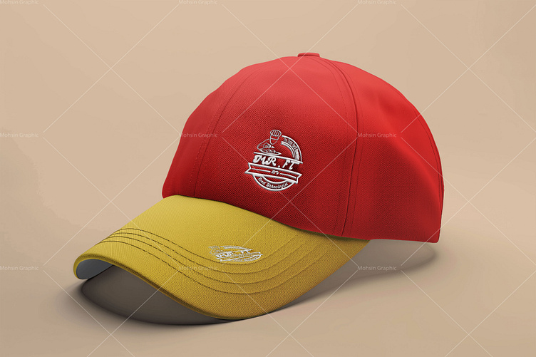
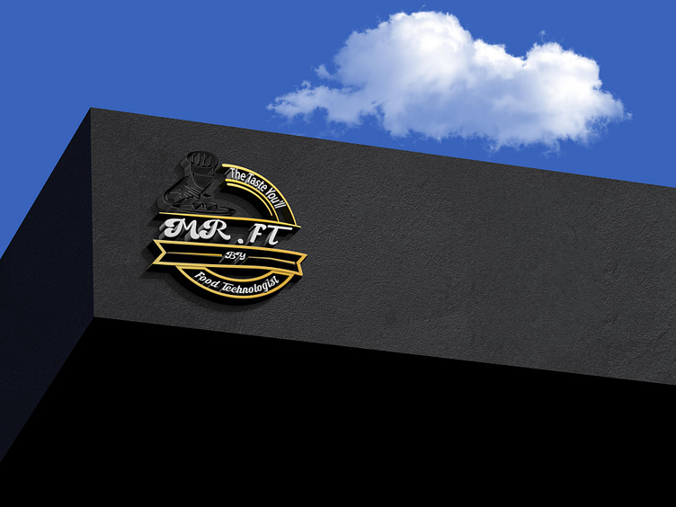
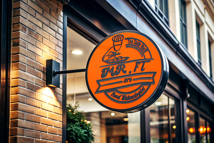

MR.FT BY Food Technologist Logo design
Mr. FT Food Technology" is placed below in a bold, modern font, with "Food Technology" in a slightly lighter weight to create a visual hierarchy. The primary colors are green and blue, with the fork and knife in a metallic silver to add a touch of sophistication.
This logo would effectively communicate the brand’s focus on merging food and technology, while maintaining a clean and modern aesthetic that appeals to both the food industry and tech-savvy consumers.
You can contact me or mail me. I think I can provide you the best design. Available for Freelance project:mohsingraphic37@gmail.com
WhatsApp:+923186773331
portfolio:
