Tim Hortons Reimagined

Tim Hortons Reimagined
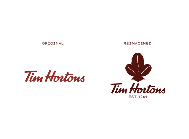
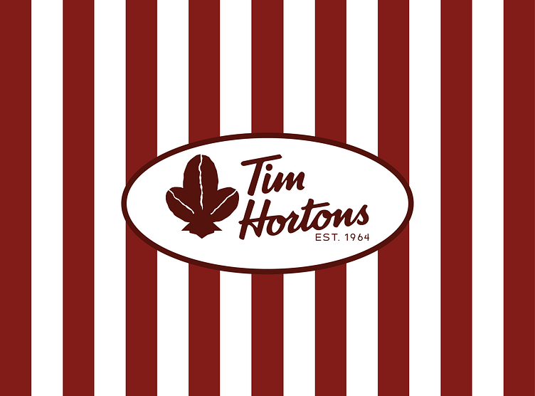
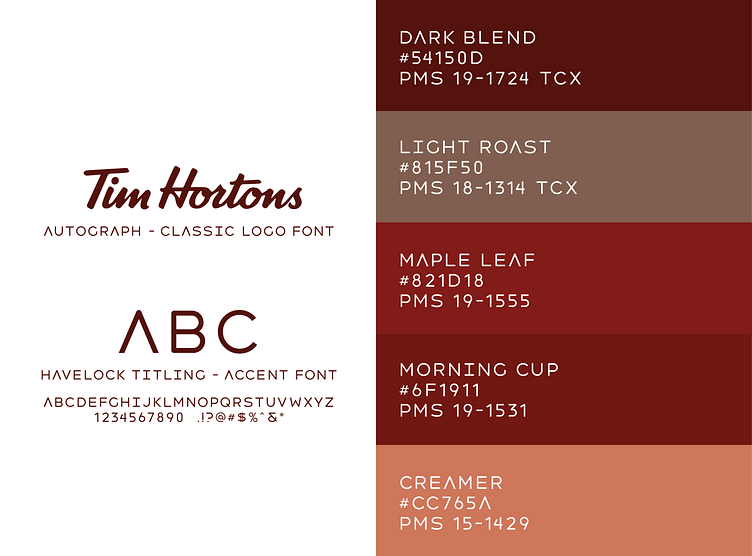
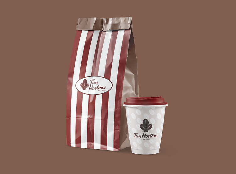
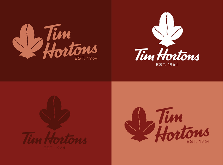
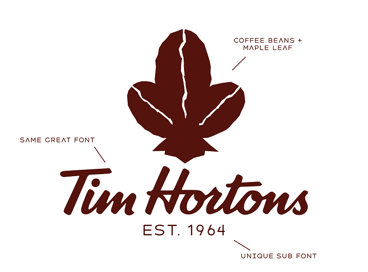
For this Rebound Challenge, we chose to reimagine the beloved Tim Hortons logo. The design focuses on maintaining the essence of the original look by keeping the Autograph font. The new additions include a color palette inspired by coffee grounds, a unique secondary font, and a logo mark that combines a maple leaf with coffee beans. The result is a harmonious blend of nostalgia and a fresh new aesthetic that captures the essence and values of this cherished brand.