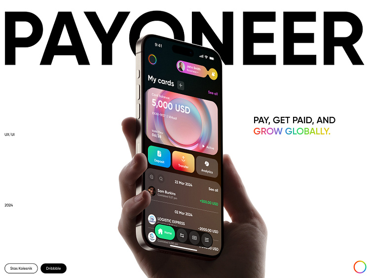
Main Screen Design Concept / Payoneer
Sneak Peek #1
✌️Hey everyone,
This is the main page design concept of a mobile application for an international digital remittance company “Payoneer” 🌈
The design is made in a bright⭐️ and rather unusual style (compared to modern mobile applications for the financial sphere🤓☝️)
I wanted to make the design close to the company logo, so I decided to use different bright colors ❤️💛💚 In this way, interface looks “playful” and friendly :)
*I have not yet started talking about the interface for different themes (black/white) and about various interesting UI elements that will change according to the user's actions. So subscribe and follow my new posts where I will talk more about this mobile app 🥹
**Yo this is the first mobile design I've posted here
Let me know your thoughts 💭
And have a nice day 🙌🌈
