⚡️ Live activity for WatchOS

Hello all 👋
A while back, I wondered in the vast world of the small screen of apple watch UI. Having worked with a grocery e-commerce app, I decided to create a live activity tracker for watch OS.
I started prioritising the vital information that really needs to be shown on the small screen of watch. I also referred to the current order tracking experience of a few delivery apps and narrowed it down to:
Delivery time or ETA
The status of order ie. "placed", "on the way" and more
Address where the order is being delivered
Number of items in the order
A glimpse of what these items are - probably pictures
Branding element on the live activity widget
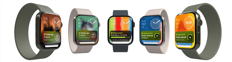
This 👆 got me to the screens shown below 👇:
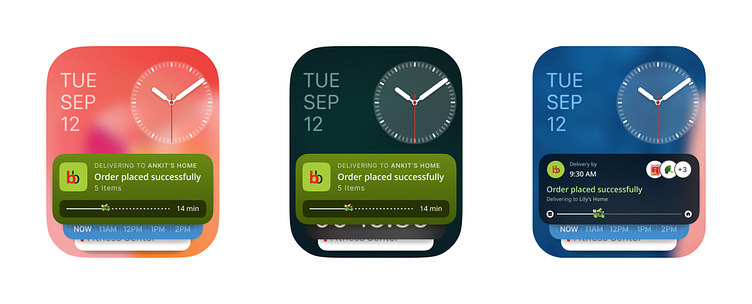
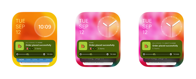
Problems with the above designs:
📎 Too much information in too little area
📎 Text sizes too small to read while brand logo takes up around 30% real estate
📎 Tiny visual elements, difficult to clearly comprehend
Enters the Human Interface Guidelines...
Since this started as a leisure project, I went straight into designs without realising the proper way of doing things! :D
At this point, I was genuinely looking for a solution to solve the above mentioned problems. When I stumbled upon this detailed article here by Apple, it was one of those oh! fish moments 🥲
This article guided me not only about correct font sizes for better readability but also gave nice pre-made layouts.
Results?
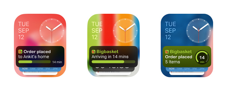
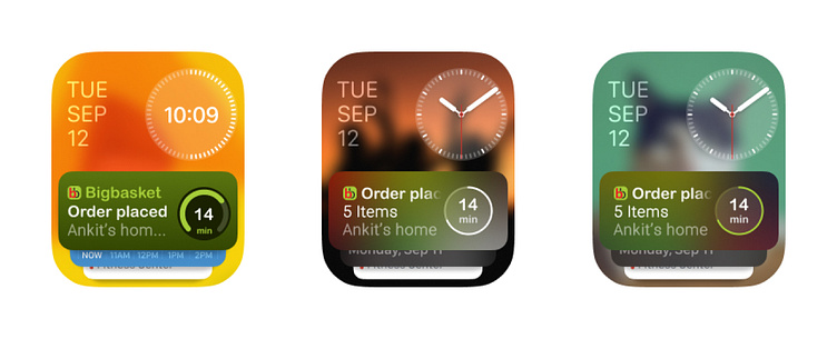
What the guidelines truly helped with was - narrowing down the crucial & required information furthermore to only be left with the absolutely very important information.
✷ Narrowed down information:
The remaining time for delivery,
not the ETA as that requires users to see the current time and do the math of remaining time.
A keyword for order status -
like "placed" or "arriving"
Delivery address - this reassures users that they've ordered at the right place.
OR
Number of items - which helps them recollect what they're getting in the order.
Out of address & items, it depends on the particular app/product what they choose to prioritise for this widget. Even though, there are some approaches which include both- it is not advised by Human Interface Guidelines to keep a lot of information on the widget.
Thank you for reading! :)
If you like this, follow me on instagram for more such content. 👋