MOR'KO
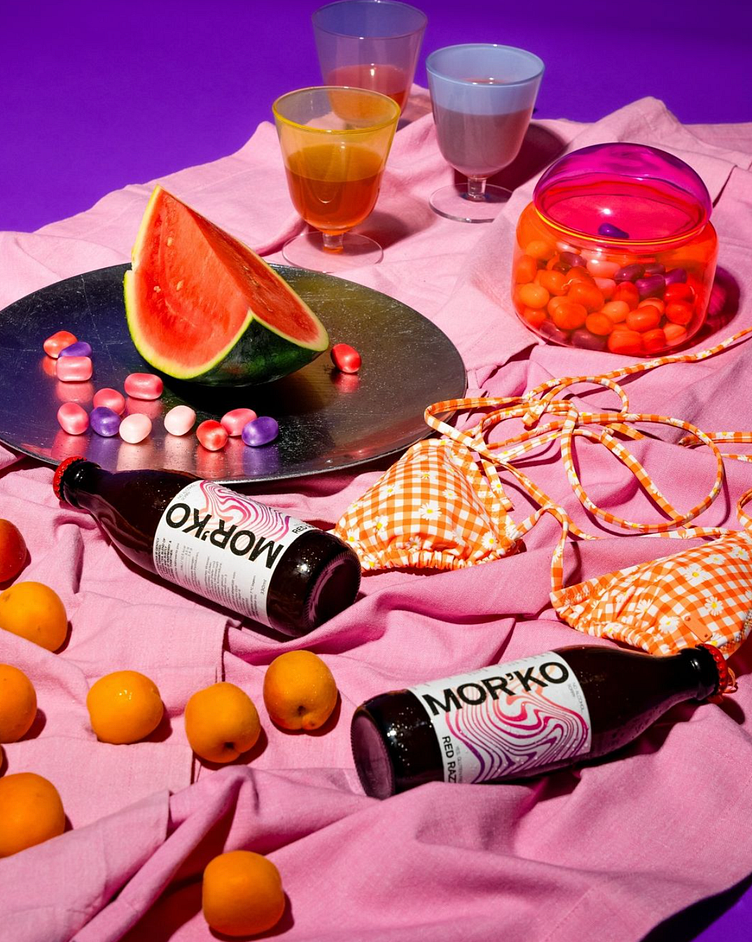
For the Kombucha brand MOR'KO, which means "Little Sea" in Ukrainian, I created a label design and poster design. The core concept revolves around abstract symbols representing waves, freshness, and fun. The designs encapsulate the essence of the sea, conveying a sense of vitality and joy. The visual elements are playful yet sophisticated, aiming to capture the refreshing and invigorating spirit of Kombucha. Through a blend of vibrant colors and dynamic shapes, the branding for MOR'KO stands out, making a bold and memorable impression.
More by Eliza Ravets View profile
Like


