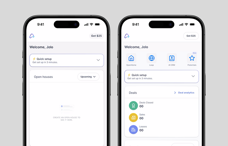
Enhancing Feature Visibility with Home Screen Shortcuts
Background: We noticed that many users were opting out of our app because they couldn't fully discover what it offers. To address this, I conducted user research and interviews to understand their pain points better.
Problem: Users were not able to easily see and access the app's main features, which led to confusion and a higher dropout rate among free users.
Solution: Based on the feedback, I decided to add shortcuts to the home screen for quick access to key features like OpenHome, Loop, AI CRM, and Potentials.
Steps Taken:
User Research: Interviewed users to gather insights on their experiences and frustrations.
Design Improvements: Added clear and easy-to-find shortcuts on the home screen.
Testing: Conducted usability tests to ensure the new design effectively addressed user needs.
Advantages:
Improved Feature Visibility: Users can now quickly see and access the app's main features, reducing confusion.
Enhanced User Experience: The streamlined home screen makes navigation easier and more intuitive.
Increased Engagement: By making it simpler for users to find and use key features, we're encouraging them to explore more and see the app's value.
Higher Conversion Rates: The goal is to convert more free users into paying subscribers by showcasing the app's full potential upfront.
This enhancement has not only addressed user pain points but also aims to increase user retention and conversion rates.

