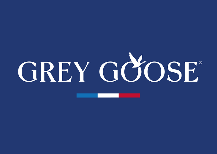
Grey Goose asset development
When Intertype studio wanted to explore ways of refreshing the Grey Goose Vodka brand, the studio got in touch with Ginger Monkey to contribute to the project. The brief was to experiment with new options and find ways of refining the brand’s visual expression for the contemporary market, without leaving behind its traditional roots. Asa Cook, the creative director, took a fluid approach, testing new concepts we developed in the design phase, narrowing the options towards the final expression. In the letterforms of the logotype, I introduced greater contrast and aimed to enhance the visual interest – for example in the capital G – to create something more individual and recognisable.
CLIENT INTERTYPE STUDIO / GREY GOOSE
In recent years, brands have simplified their iconography, however with Grey Goose we added greater depth and detail to the brand’s famous goose silhouette. The wings are more defined, their intersection with the bird’s body has been reworked, and its torso has been thinned to create a silhouette that is more elegant and lifelike. The goose’s form has been subtly introduced to the logotype. Asa observed that you never see just one goose on the wing, so we worked on a secondary mark with two additional birds in the background, bringing greater depth to the visual identity.


