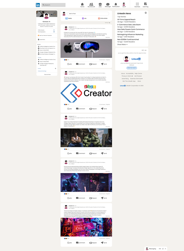
LinkedIn Profile Design - Figma Creation
LinkedIn Profile Design - Figma Creation
I designed this LinkedIn profile page using Figma, focusing on creating a clean, professional, and modern layout that effectively showcases the user's skills and experiences. Here’s what went into the design:
Research and Inspiration: I researched current trends in professional profile designs and gathered inspiration from various sources to ensure the layout is both visually appealing and user-friendly.
Wireframing: I started with basic wireframes to outline the structure and flow of the profile page, ensuring that all essential elements are included and logically placed.
Color Scheme and Typography: I selected a color scheme that conveys professionalism and trustworthiness, paired with clean and readable typography for clarity and ease of reading.
Visual Hierarchy: I implemented a strong visual hierarchy to guide the viewer's attention to key areas, such as the profile picture, headline, and summary sections, ensuring important information stands out.
User Experience (UX): I focused on creating an intuitive and seamless user experience, with easily accessible sections for skills, experience, education, and recommendations.
Responsive Design: The design is optimized for different devices, ensuring it looks great on both desktop and mobile screens.
Final Touches: I added subtle design elements, such as icons and dividers, to enhance the overall look without overwhelming the content.

