Online Education Website
Hello, friends!
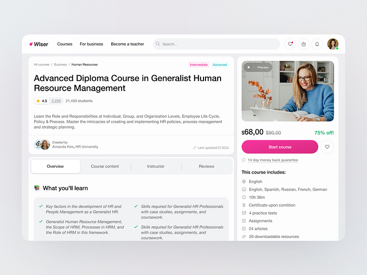
I am glad to present to you the new concept for a course page designed for an online education portal!
The goal of this project was to create an appealing and accessible design that motivates users to learn and makes information easy to digest.
Soft pastel tones with bright accents were chosen as the primary colors. This color scheme is intended to evoke positive emotions and associations with playfulness or something fun and interesting, which helps make the material more approachable.
For the text content, Helvetica Neue was selected. This font is known for its readability, which is crucial for educational websites. The font size was also carefully chosen to ensure that people of all ages and physical abilities can easily read the course information.
The course description page is structured to present information in a logical and sequential order.
Key sections, such as the course content and pricing, are placed prominently on the right side and remain fixed while scrolling, ensuring easy access to information and purchase options.
How do you feel about the result? I would appreciate any feedback you can give✨
Don't forget to press "❤️" if you enjoy it :)
------------------------------------
📨 Get in touch: Telegram, Whatsapp, rofu.asya@gmail.com


