LONG PHUNG RESTAURANT | LOGO DESIGN & BRAND IDENTITY
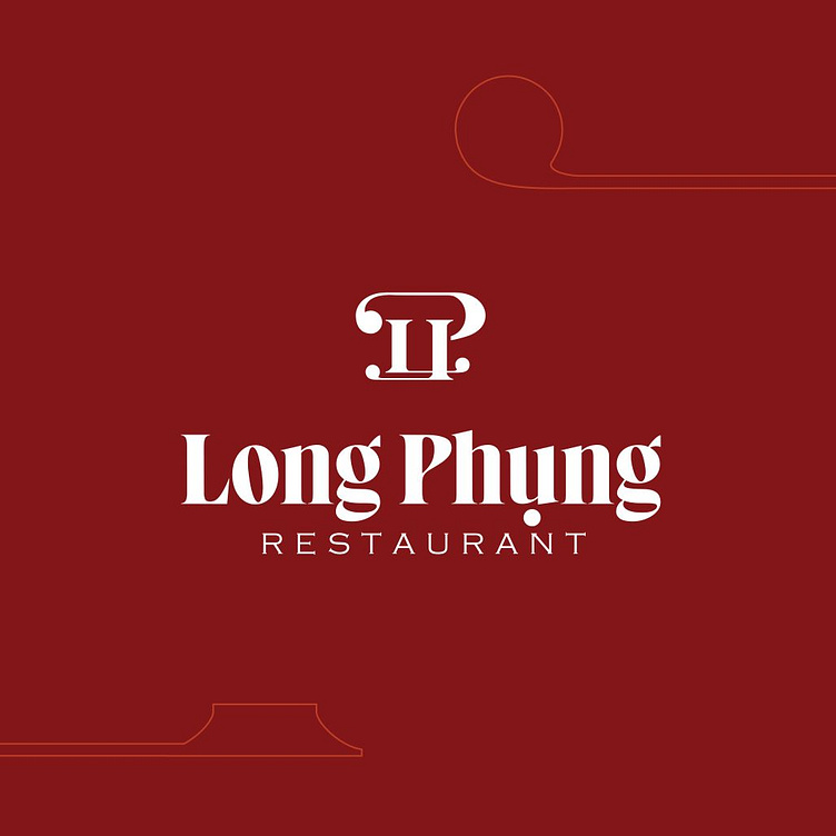
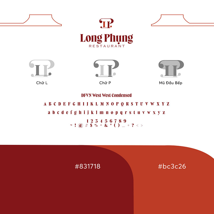
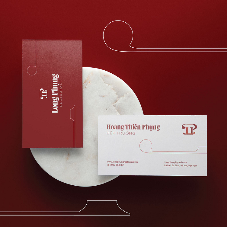
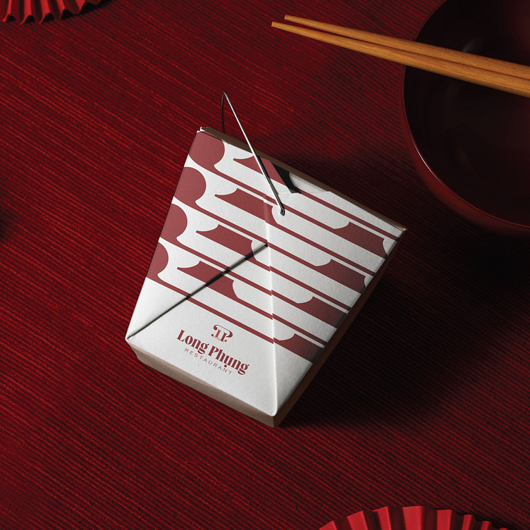
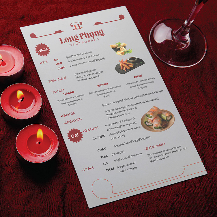
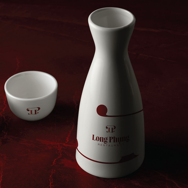
The logo design for Long Phung Restaurant brings a sophisticated blend of classical and modern styles, creating a distinguished and upscale appearance. The primary dark red background symbolizes luck and prosperity in Eastern culture, harmoniously combined with the white text and symbol, generating a strong yet elegant contrast.
The symbol above the restaurant's name is a unique design, reminiscent of the stylized letters "L" and "P." The clever use of curved lines creates a symbol that is both simple and refined, showcasing unlimited creativity. The font used for "Long Phung" has soft, flowing lines, evoking a sense of elegance and grace. The word "RESTAURANT" below is written in a simple, modern font, balancing the overall design and ensuring easy readability.
Additionally, the logo features subtle details like the curved lines at the corners of the background, adding softness and a welcoming feel, reminiscent of intricate decorative patterns in traditional architecture. All these elements not only make the Long Phung Restaurant logo stand out in a crowd but also convey the message of a high-end restaurant where customers can enjoy exquisite cuisine in a luxurious and cozy atmosphere. This logo design excellently reflects the spirit and values that Long Phung Restaurant aims to bring to its customers, while also asserting its position in the food service industry.
Designed by Bee Art
-
Client LONG PHUNG RESTAURANT
Logo Design Project. Logo is designed for Restaurant.
Copyright© Bee Art. All Right Reserved
Contact us:
• Hotline/ Zalo: (+84) 77 34567 18
• Email: info@beeart.vn
• Website: www.beeart.vn
• Facebook: https://www.facebook.com/BeeArt.vn