Niō Bit SC Wide v1 font for timestamps on iDter
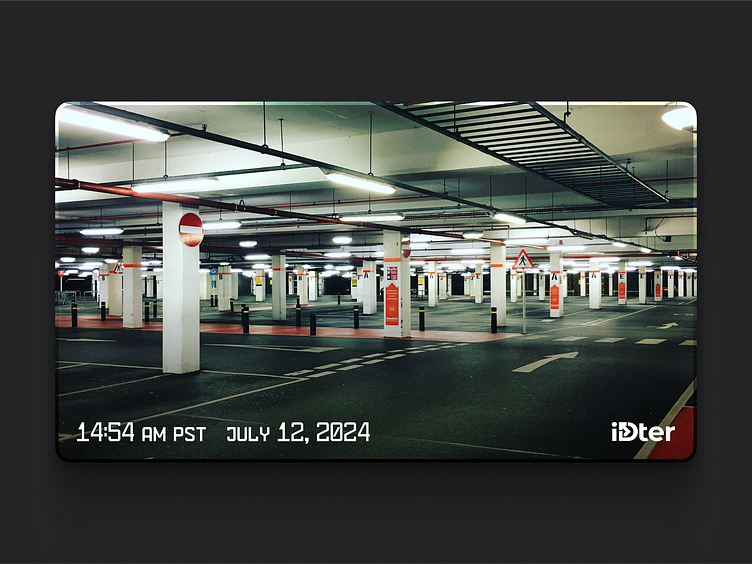
When working with timestamps for recordings on iDter, it became obvious that humanistic grotesks do not work well enough for displaying time and date. Something more geometric and monospaced was needed. Given the importance of the digits in date and time, they needed to look distinctive and be easy to read. Small capitals (SC) were required to show additional information like AM/PM or time zone without taking up a lot of space.