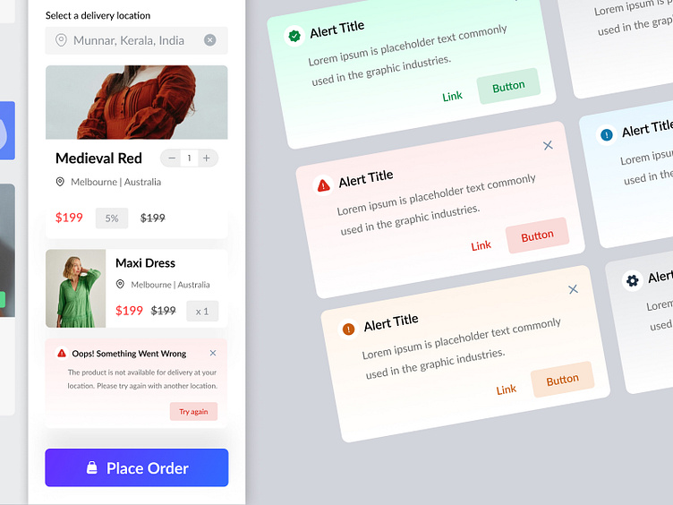
UI Element - Alert : E-commerce Checkout
Hey Dribbble! 👋
We're excited to showcase our latest design exploration: Alert Patterns and with a scenario for E-Commerce Checkout! 🚨✨
Explore how we've tackled critical error alert in the e-commerce checkout process with versatile designs suitable for both light and dark themes. Our focus is on clean layouts, effective use of imagery and icons, and ensuring users are guided smoothly through any disruptions.
Scenario Covered:
Shipping Error : When there's a problem with the shipping address or method.
Design Elements:
Icons: Clear, recognizable icons for each type of alert.
Imagery: Subtle use of imagery to enhance visual communication.
Color Schemes: Light and dark theme variations to fit different user preferences.
Actionable Buttons: Clear call-to-action buttons for retrying, updating information, or contacting support.
Swipe to see the full version! 👇
Hope you enjoy it! 😁
Press "L" if you love it and feel free to give me some feedback
what your opinion about this?
---------------------------------------------------
Connect : priyankathirumal2001@gmail.com
---------------------------------------------------


