Makelog relaunch
Overview
As part of Makelog's major relaunch from September 2022 to January 2023, we focused on overhauling the public changelog system to improve user experience and customization. The project aimed to make the changelog more intuitive and user-friendly by adding new features such as search and filter capabilities, enhanced customization options, and tailored email updates. By incorporating extensive customer feedback from interviews and session observations, we ensured that the changelog not only met but exceeded user expectations, making it a more engaging and valuable tool for managing and communicating product updates.
Problem
The main challenge was revamping Makelog's public changelog to be more user-friendly and customizable. Users needed better ways to search, filter, and scan content quickly. They also wanted a more intuitive entry modal and the ability to subscribe to tailored email updates. The goal was to make the changelog super easy to use and customizable to fit different customers' website styles.
My role
As a product designer, I was responsible for designing the new features and user interfaces for the public changelog and the new entry modal. My tasks included conducting user research, creating wireframes and prototypes, and working with the development team to implement these enhancements.
Timeline
September 2022 - January 2023, Launched
Research and Discovery
Our approach kicked off with thorough research and discovery, where we got up close and personal with our customers to gather feedback and understand their needs. We conducted interviews, usability tests, and analyzed customer sessions to pinpoint pain points and areas for improvement. Since we were a small team, we could really zero in on what our customers needed, making their direct feedback invaluable in shaping the direction of our updates.

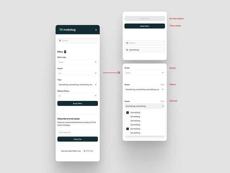
Search and Filter Functionality
I introduced robust search and filter capabilities to help users find specific entries quickly. The previous filter UI was limited and did not fit the evolving requirements of our users. After gathering feedback from customer meetings, I discovered that a more efficient way to implement filters was needed.
To address this, I designed a sticky header with search and filter options, allowing users to access these tools conveniently as they scroll through the changelog. This redesign ensures that filters are always within reach, making it easier for teams managing a high volume of updates to locate relevant information with ease. Customer feedback confirmed that this new approach significantly improved their workflow and user experience.
By reducing the cognitive load through improved search and filter options, we made it easier for users to find the information they needed without being overwhelmed. The sticky header ensures that essential tools are always accessible, further enhancing usability.
Stacked Cards Feature
A new stacked cards feature was added to present changelog entries in a visually appealing and organized manner. This design choice helps users scan through updates more efficiently.
Want to work with me? I’m available for new projects


Changes to the New Entry Modal
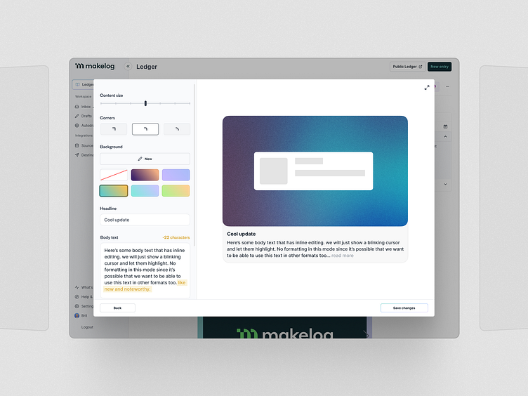
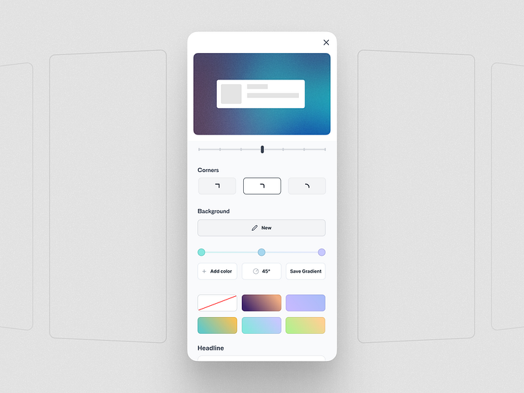
The new entry modal received significant updates, including better background gradient customization, corner radius controls, and a content size slider. These features allowed users to tailor the appearance of their changelogs to match their brand identity.
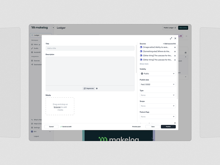
We redesigned the entry modal to include a two-step process with a more user-friendly two-column layout in the first step. Additionally, AI generative tools were integrated to help users write changelog entries using information from connected project management tools like Linear.
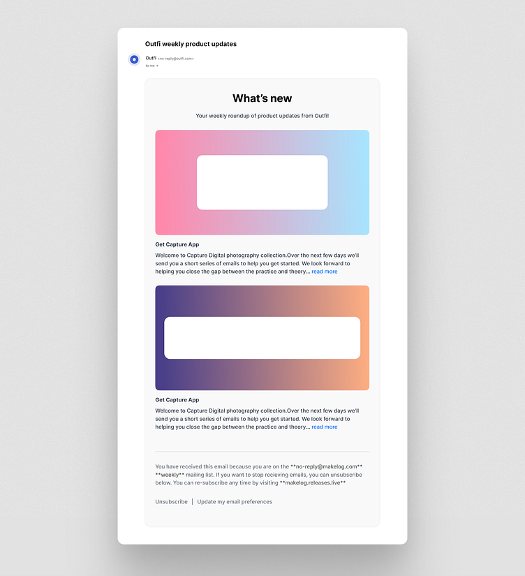
Email Subscription Features
We added a feature that allows users to subscribe to email updates of the changelog. Users can customize their subscriptions to receive updates on specific types of changes, such as bug fixes, new features, or improvements. This ensures they only get the information they care about.
Customer Feedback and Customization
Throughout the project, we maintained close communication with our customers, incorporating their feedback into our design process. Customers appreciated the enhanced customization options, which allowed them to align the changelog with their website’s style, making the tool feel more integrated and familiar.
Conclusion
The relaunch of Makelog’s public changelog was a successful endeavor that significantly improved the user experience. By focusing on customer feedback and leveraging key UX principles, we were able to create a more intuitive, customizable, and efficient tool for managing product updates. These enhancements not only met but exceeded customer expectations, reinforcing the importance of user-centered design in product development.
Considerations for Future Enhancements
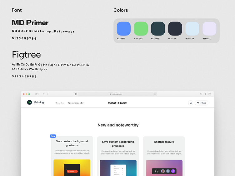
During the design process, I also explored additional concepts to further enhance user engagement. One such idea was the "New and Noteworthy" section, which would allow users to curate and highlight important updates. This feature aimed to provide a space for curated content that could be linked back to detailed changelog posts, making it easier for users to find and share significant updates.
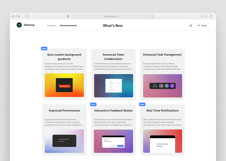
Although this concept didn't make it into the final product, it represents an area for potential future development. Including features like this could further enhance user engagement by providing a platform for highlighting and sharing key updates in a visually appealing way.