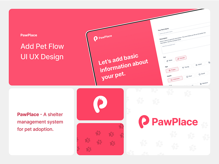
PawPlace - Add a pet listing flow UI UX design
Here's another approach I designed and researched for adding a pet list, but before we move forward, if you haven't checked out my previous shots, go through them first for better context.
This pet listing flow for PawPlace demonstrates a user-centred design approach, ensuring that shelter staff can efficiently and accurately create pet profiles.
The pet listing process is divided into clear, manageable steps to reduce cognitive load and prevent user overwhelm. Each step focuses on a specific aspect of the pet's profile, such as basic information, photos, and detailed descriptions.
This ensures completeness and allows users to focus on one task at a time, reducing errors and improving data accuracy.
Adding Pet Photos: A crucial aspect for pet listings. High-quality images can significantly impact the pet's adoption prospects. The design encourages users to upload at least five photos, highlighting the importance of visual appeal.
The layout is intuitive, with a large preview of the main photo and placeholders for additional images, following the principles of aesthetic and minimalist design.
The final screen allows users to review all the entered information before finalizing the listing. This step ensures accuracy and completeness, reducing the likelihood of errors.
I hope you like it ❤
Follow me for real daily app and web design inspiration ✨
Have a project? 1 spots left for this month
Email me at: sameersidd.design@gmail.com or message me on Dribbble!
That's All Folks!
Become a part of my community to learn more about UI UX.


