Investment Insight Dashboard 📊
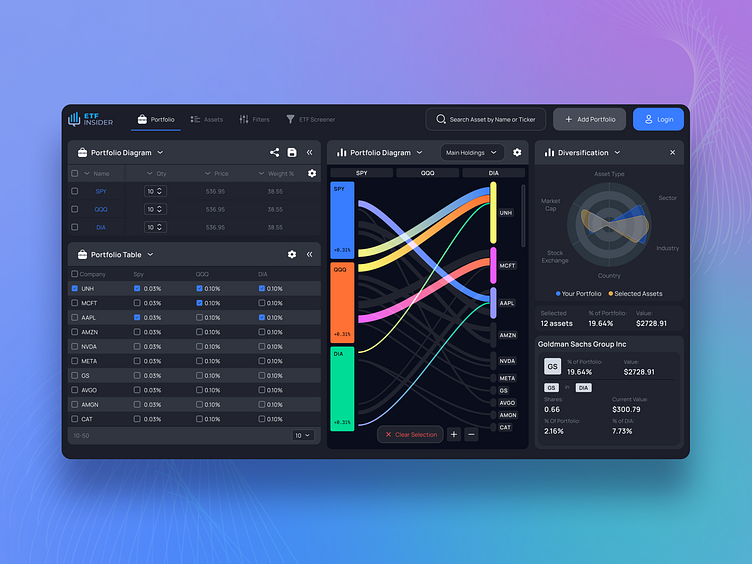
Welcome to a new era in portfolio management, where sleek design meets advanced functionality in my latest project. Drawing on a deep understanding of investor needs, I have integrated a high-contrast color palette that not only enhances visual appeal but also promotes ease of data interpretation. The choice of vibrant colors against a dark background ensures that important details stand out, facilitating quick and efficient analysis. 🌈
Innovative design elements like the interactive portfolio diagram and dynamic data visualization tools exemplify the project's focus on user experience. These features are designed to offer users a seamless and engaging way to track their investments, with real-time updates and intuitive navigation paths that guide them through complex financial information with ease. 📊
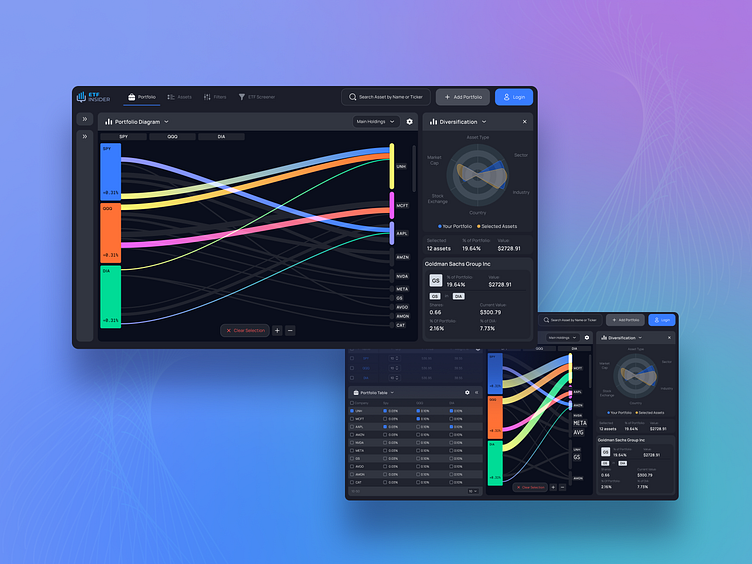
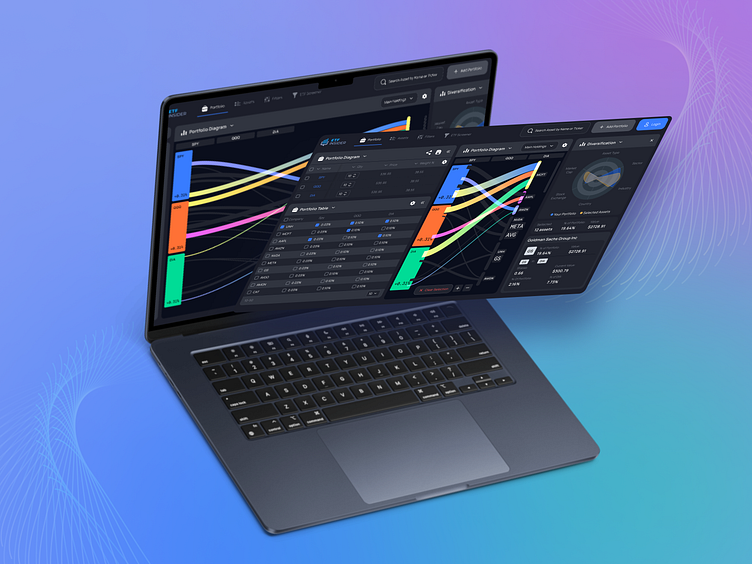
The UI is complemented by a responsive layout, ensuring that whether on desktop or mobile, functionality remains top-notch. This adaptability reflects a forward-thinking approach to design, considering the varied environments in which users may access the platform. The streamlined interface incorporates minimalist principles, reducing clutter while maintaining accessibility and usability. 🖥️📱
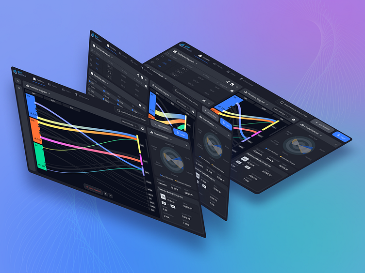
The culmination of this project is a testament to the power of thoughtful UI/UX design in the financial technology sector. It's not just about creating something that looks good—it’s about crafting an experience that empowers users to make informed decisions with confidence and precision. This platform is designed not just for today’s market, but to adapt to the future of investing, making it a timeless piece in any financial enthusiast's toolkit. 🚀
Let`s work together!
