Cafe Bustelo - Word Mark Case Study
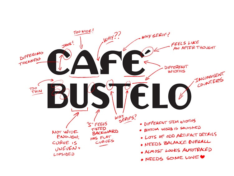
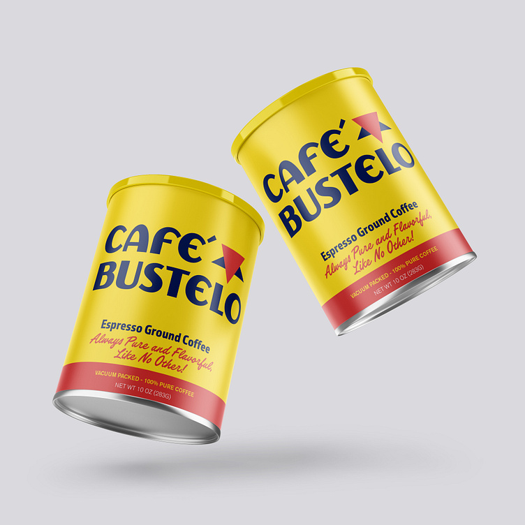
Have you ever noticed some of the weird quirks on the letterforms in the Cafe Bustelo word mark? The odd little cut into the stem of the "F", the serifs on the crossbar of the "T", the super wide "A", and the thin bowls on the "B"? That's just to name a few!
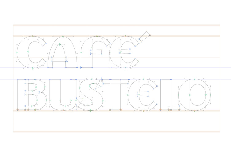
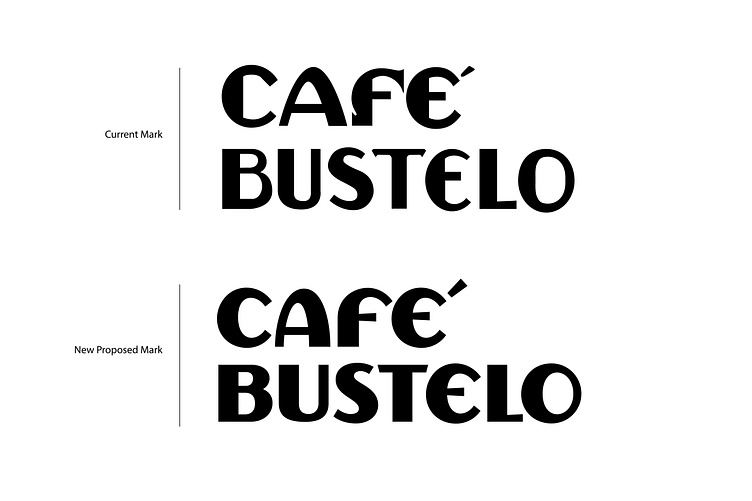
In this case study, I audited the current word mark noting some of the details that need some overhauling and fine tuning. I addressed the issues listed above as well as crafting each letterform from scratch while still giving them a nod to their past DNA. The new letterforms are now more consistent and balanced in weight, widths and style while also feeling modern and fresh.
Jeremy Friend
Custom Lettering & Typography
www.jeremyfriend.com | Follow along on Instagram
LET'S WORK TOGETHER
Email: jfriend.studio@gmail.com