De Nieuwe Gemeente - Brand System
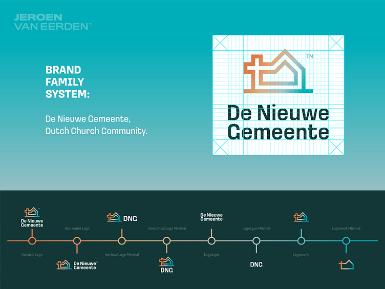
De Nieuwe Gemeente (DNG) - Brand System
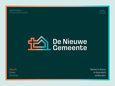
Cohesive Identity for a Dutch Church Community
⛪️
I recently had the pleasure of designing a new logo and visual identity for a Dutch Church Community, created to reflect the fusion of three communities into one cohesive brand. This project included the development of a comprehensive 'Brand Family System' to ensure a unified and consistent identity across all visual elements.
Visualizing this identity timeline was particularly rewarding, as it clearly demonstrates the path of usage and cohesive branding.
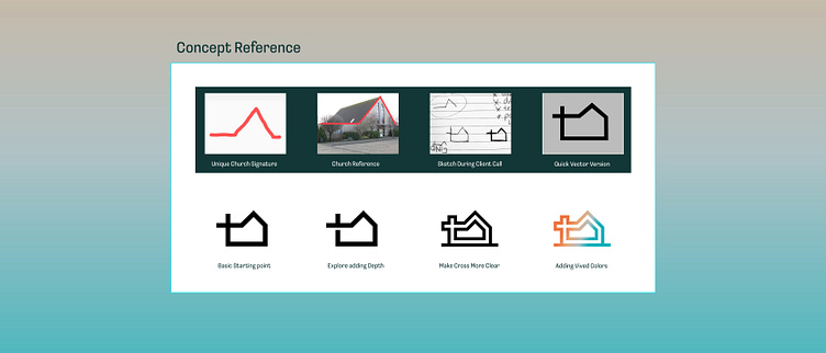
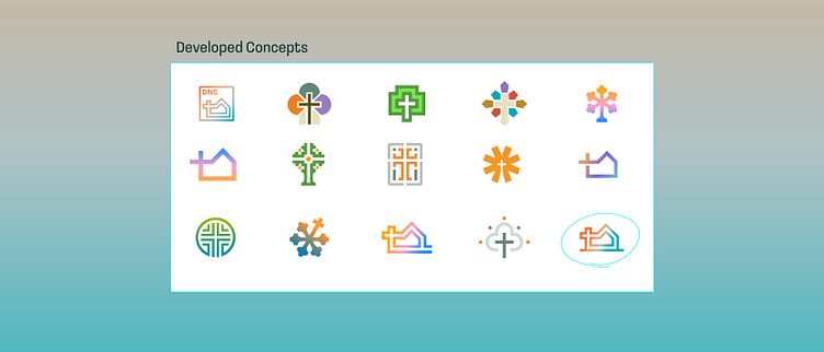
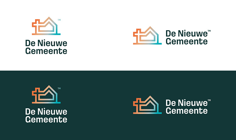
The logo mark itself holds significant meaning. Inspired by a conversation with my client, we incorporated their current church’s signature shape into the new logo. This subtle yet powerful idea was further enhanced with a vivid gradient, representing their modern approach to embracing diverse humanity.
Our goal was to merge a reference to the church with the symbol of a tree, symbolizing life (didn’t worked as good as we hoped for during the project). The final result is a strong, simple, and meaningful design that truly captures their identity.
Let's work together and elevate your brand! 🚀
Feel free to reach out via Dribbble DM or E-mail:
👉 info@jeroenvaneerden.nl
💼 Connect with me on LinkedIn / Read my Client Recommendations
🎬 Check my YouTube for Logo Tutorials / Learn Logo Design
🔗 Follow me on Instagram / See BTS and New Content
🛒 Buy my pre-made or unused logos from the portfolio
💬 Tweet with me