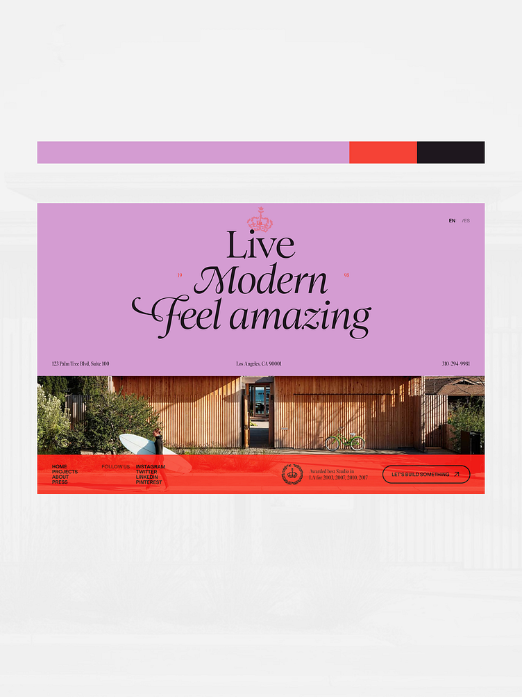
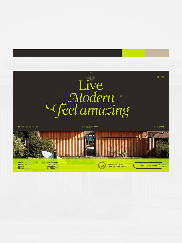
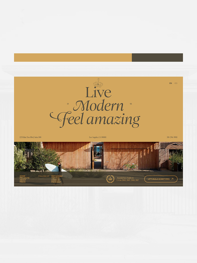
Color ways for Mabar studio
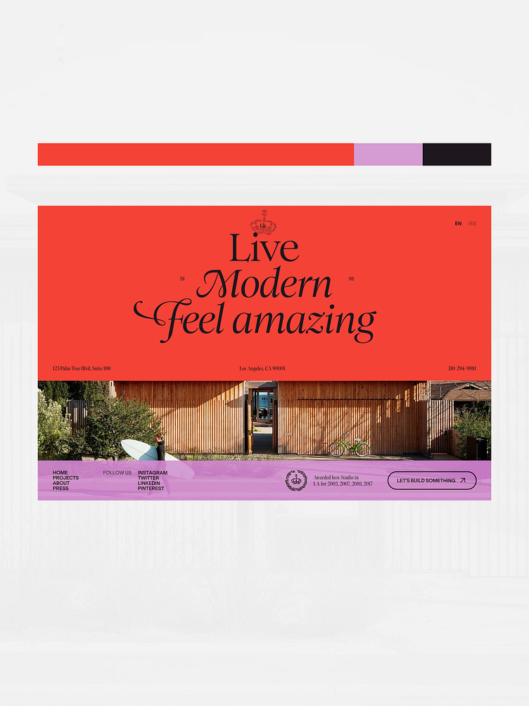
One of my favourite part of the process, experimenting with colors. Sometimes picking colors is difficult because there are many combinations that could work. I typically go in with an open mind and try to think outside of the classic "this X color is for this Y case" to not bash any options. The editing happens later.
Once I got multiple CW I can look at them as a whole and see what works. For this project I landed on a light background and an bright orange/yellow combo for the typography and secondary elements. I felt that it brought out the typography and fit the South California vibe better than the others.
Feel free to disagree and drop a comment if you liked another color way better!