Maitre de The Selection - Packaging design
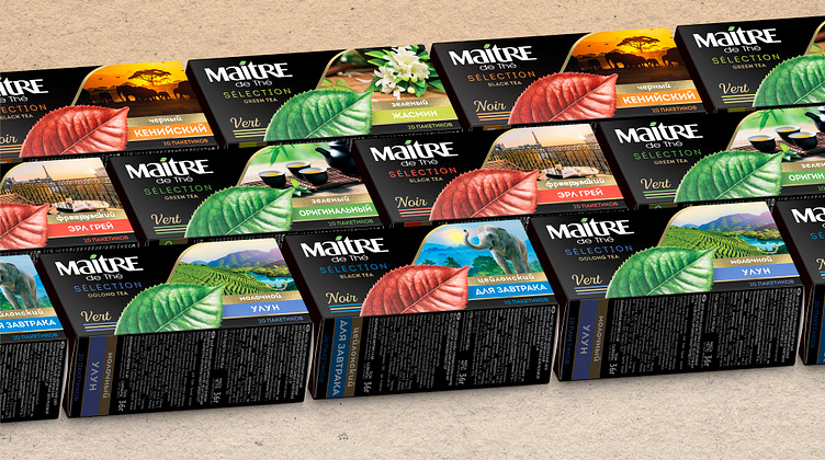
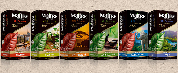
In our packaging design for the exclusive tea line - MAITRE DE THÉ SELECTION we combined highly captivating elements of nature with stylish art to produce a truly emblematic design.
Our core ideas and approach to this design aim to facilitate the themes of health and the transcendent scope of the environment which are ultimately integral to the brand. The intention of combining such elements was not limited, with alteration between each design being dependent on the flavor of the tea. An example of this pattern can be found in differences between black and oolong teas, which are exceedingly wild and powerful and the slightly more timid green tea.
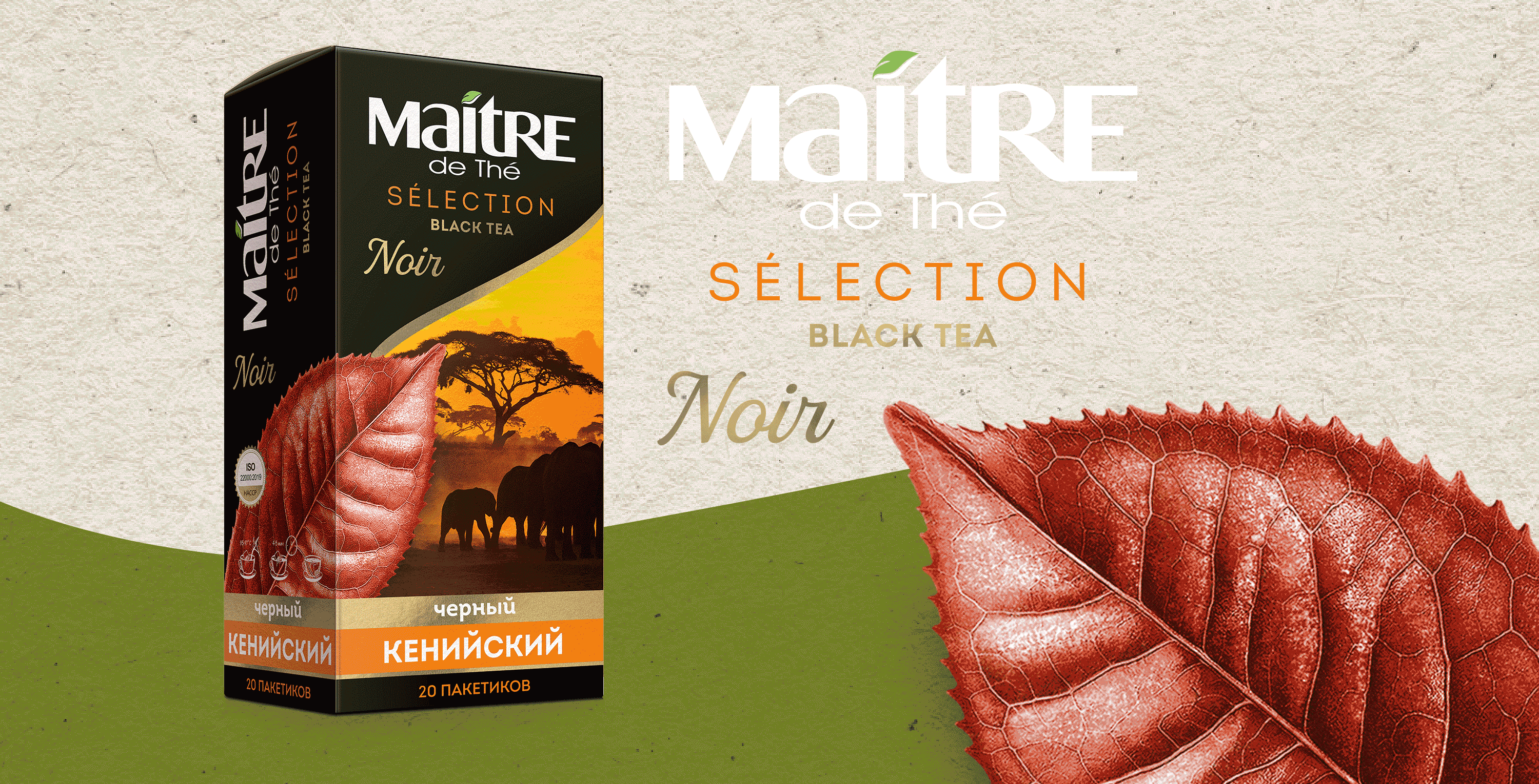
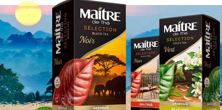
Each design features a highly detailed leaf – initially hand drawn, which aim to enhance the clarity and communicativeness of the content of the packaging. There is also a clear distinction between the leaf’s themselves, with the black tea utilizing a dark shade of red, illustrating the color of the black tea leaf. Whilst similarly the green leaf encompasses both Oolong and Green teas.
The art for the black tea packages distinctly follows a more gloomy yet simultaneously calming tone - an alluring sunset view of the Eiffel tower and a sunset landscape of the environment. Both highly encompassing of the nature of black tea itself and the shades of the leaf besides it. Green and Oolong teas utilize significantly more bright colors, with the art direction of the green tea flavor mainly consisting of different shades of green and photographic depictions which symbolize the remedial and calming properties of the herb through the use of flowers and steaming hot cups.
The text on the packaging brings the artistic elements together in sync. Employing exceptionally stylish fonts which are both easy to discern from a distance and fitting with the themes of the design.