ACE Wayfinding Iconography
Back in 2022 I was asked to develop a wayfinding system for ACE, a family of creative agencies.
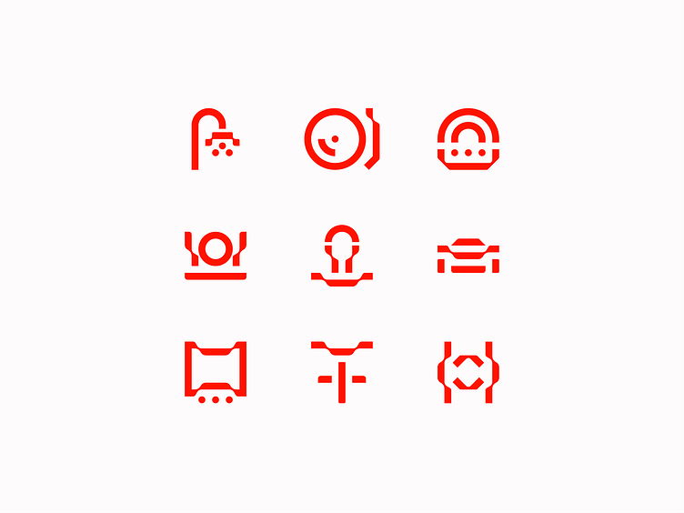
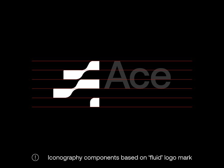
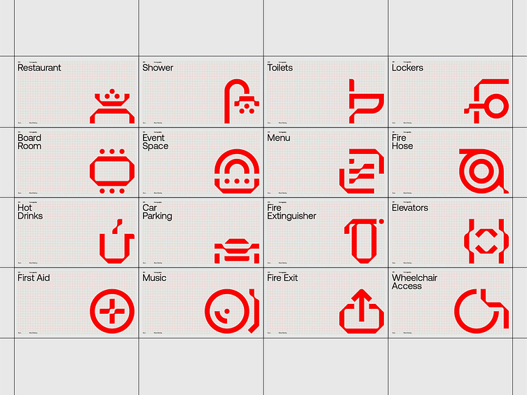
The concept of ‘Making Waves’ was the starting point for ACE’s wordmark, designed by Smörgåsbord. I used the components of the ‘A’ mark as a starting point for the iconography system, limiting the amount of different shapes to build the icons from.
Using a limited set of shapes resulted in new ways of communicating certain messages and made the overall experience inside the offices even stronger regarding consistency and brand recognition.
Got a project idea? Let's work together! :)
