SKYLINE COURT | LOGO DESIGN & BRAND IDENTITY
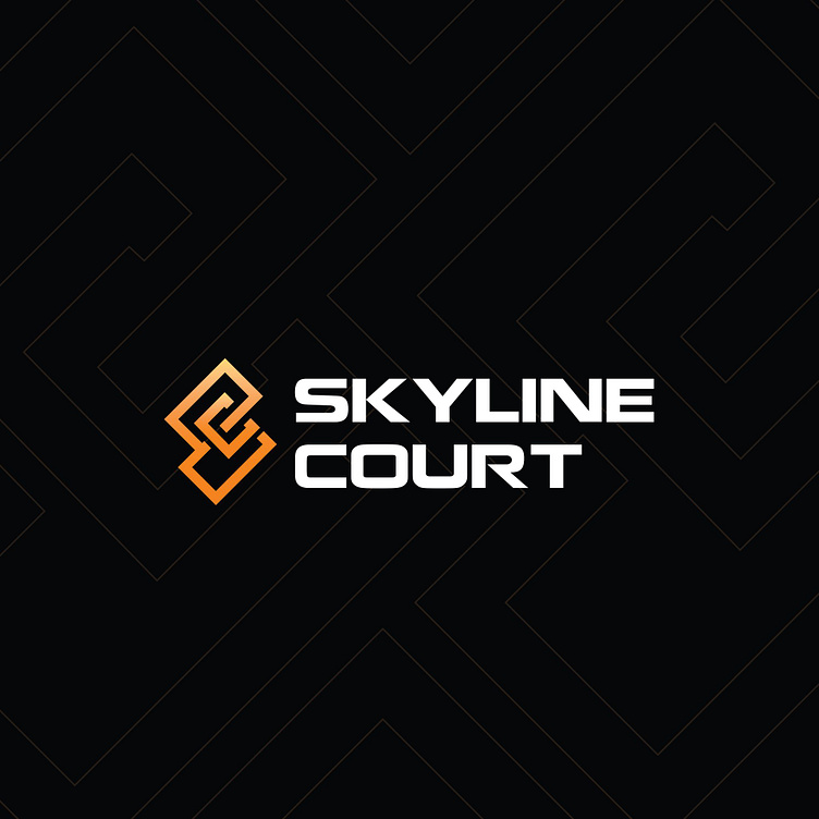
The Skyline Court logo is expertly crafted from the seamless integration of the letters S and C, not only creating a unique image but also evoking the skyline of towering buildings, perfectly reflecting the spirit and meaning of the name "Skyline." The intertwined symbol in the logo also conveys a sense of strong relationships and robust connections within the community, akin to a sturdy building constructed from solid bricks. This aligns with Skyline Court's vision and mission to create a sustainable development environment and a prosperous community.
The logo features two primary colors, orange and white, set against a black background, creating a sharp contrast that captures attention and leaves a powerful impression from the first glance. The font used for the text is modern and bold, with sharp lines that enhance the brand's presence and recognition.
Designed by Bee Art
-
Client Skyline Court
Logo Design Project. Logo is designed for Software Company in Vietnam.
Copyright© Bee Art. All Right Reserved
Contact us:
• Hotline/ Zalo: (+84) 77 34567 18
• Email: info@beeart.vn
• Website: www.beeart.vn
• Facebook: https://www.facebook.com/BeeArt.vn


