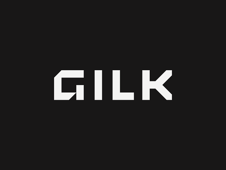
Gilk Logo
The Gilk logo was designed to feel sturdy and precise, mimicking the angles of a dovetail joint in high-end carpentry. We carried those angles throughout the design system, using them as photo masks and in supporting patterns.
The GILK brand patterns are also inspired by linework commonly used in blueprints, and an underlying grid system and neon arrow block are used to direct viewers eyes to pertinent information and add a bright pop of color.
Here's a closer look at the full logo and its construction, along with some further brand application.
Full case study: https://malley.design/work/gilk/
More by Malley Design View profile
Like

