Buttons - Desktop UI
Hello! 🌟
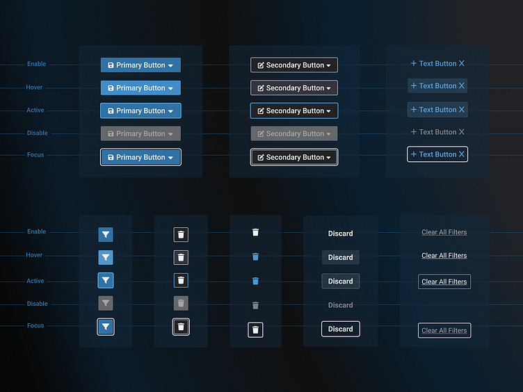
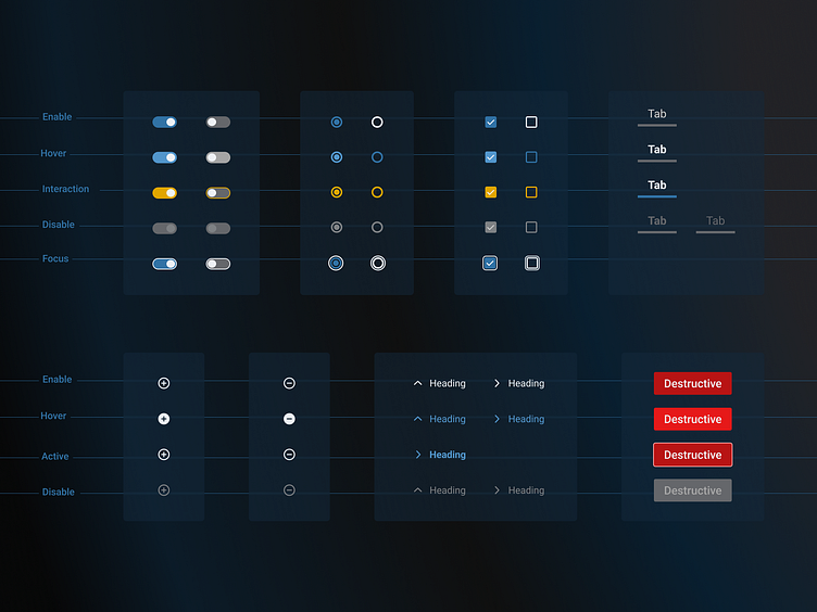
Excited to share my latest design system inspiration shot, featuring a comprehensive set of buttons designed specifically for desktop UIs in dark mode. This shot showcases a variety of button types with different states and variations, providing a solid foundation for any design system.
🔍 Key Features:
Diverse Button Types: Includes toggle buttons, radio buttons, checkboxes, and more.
State Variations: Each button type is displayed in multiple states, including enable, hover, interaction, active, disable, and focus.
Dark Mode Design: Tailored for dark mode interfaces, ensuring a sleek and modern look without overcrowding the screens.
System Status Indicators: Uses color coding to represent different system statuses (e.g., destructive button for critical commands and yellow for interacted buttons). The yellow color is used to highlight user interactions, making it easier for users, especially in defence applications, to see changes before finalizing or sending commands, ensuring accuracy and reducing errors.
This design is particularly beneficial for applications requiring detailed system monitoring and management, such as military command and control systems, intelligence analysis platforms, and defence logistics management.
Feedback and suggestions are always welcome! 💬✨
THANK YOU!
Special thanks to the former UX Designer of the project, Esra Altun, for her early contributions to the design system, patterns and layout!