Datwit Landing Page v2.0
This work is licensed under Creative Commons Attribution-NonCommercial-NoDerivatives 4.0 International License by Enma Lidia Muñoz García
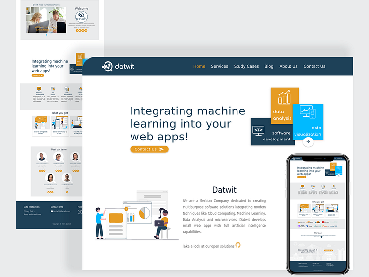
Datwit is a young Serbian Company dedicated to creating multipurpose software solutions integrating modern techniques like Cloud Computing, Machine Learning, Data Analysis, and microservices. Also develops small web apps with full artificial intelligence capabilities.
Coming from a basic design for its landing page they are looking forward to improving it with the purpose of a better work showcasing and experience of their audience.
Challenge
After reviewing the first landing template, these were the issues found:
The team finds the previous version very boring and common
The chosen color palette is very used around the tech world and they want to set themselves apart from that.
They need better branding for their company, but they can't afford a professional.
They want to use things from this already paid template and therefore use the same technologies.
This previous version isn't responsive enough.
The shown content needs to be rewritten and improved to highlight what the company does.
Solution
We are trying to achieve with this version:
Make a design tailored to the company's personality. They define themselves as simple, minimalistic, modern, trustworthy people and functionality first seekers.
Use a material design-inspired approach.
Choose the desired color palette that captures a modern and neutral vibe with some accent colors.
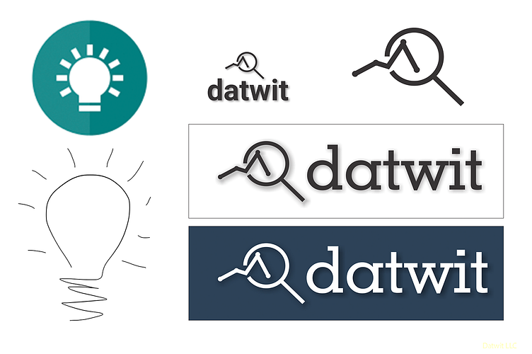
Change the company name and logo.
Make a totally responsive website.
Every visual component should be focused on a better display of the copy content.
Design milestones
Color palette
Choosing the color palette proved to be a challenge and after many thoughts, the team settled on this:

Logo
Then the next step was improving the logo. Going through this idea:

Typography
We chose the Comfortaa font family as the main typography for the logo and also to be used in headers all over the site. We believe this rounded and without serif typography convey effectively our young and free spirit. In the logo, we keep it lowercase to communicate our self-sufficiency and boldness in taking on challenges.

Wireframing
We made hand-drawn sketches to save time and to see how the design might be evolving. From the first rough sketches, the design evolved to low-fi wireframes.


