ONELAB | LOGO DESIGN & BRAND IDENTITY
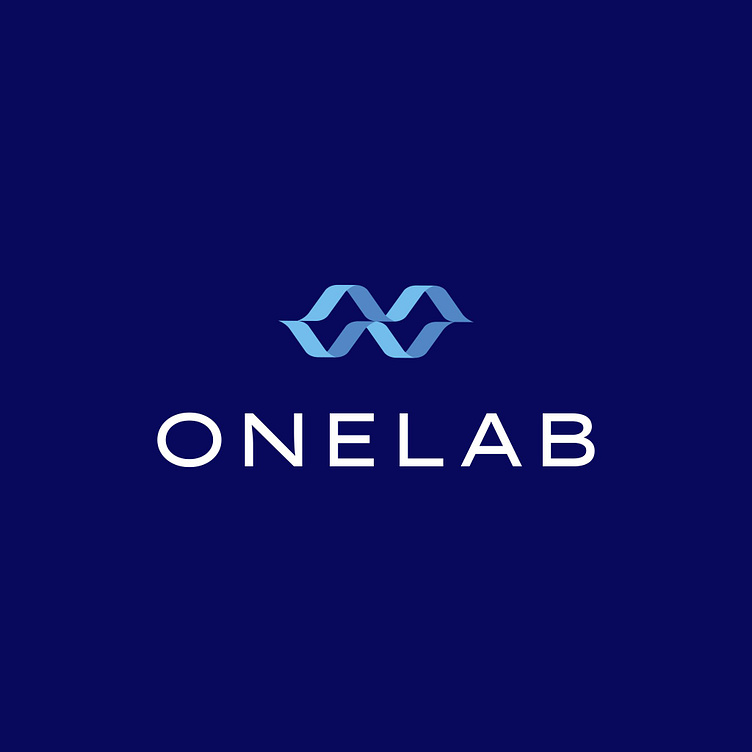
The "ONELAB" logo uses the image of a DNA strand as its main symbol, combined from simple shapes, conveying clarity and cleanliness, thus emphasizing professionalism. This symbol is designed with soft and refined lines, creating a sense of connection and continuity, similar to the structure of DNA – a symbol of life, evolution, and innovation. The dark blue background highlights the light blue DNA symbol, evoking a sense of security and reliability, while also representing advancement and modernity.
The inclined direction of the symbol not only creates a strong dynamic but also implies aspiration, the drive towards the future, and global integration. This reflects "ONELAB's" commitment to continuous improvement and development, aiming to provide groundbreaking and effective solutions in the field of research and development.
The "ONELAB" text below the symbol is written in a simple yet bold font, with clear and legible lines. This not only makes the logo easily recognizable but also reflects the modern and advanced nature of the brand. The font choice also conveys a sense of reliability and professionalism, which is very fitting for a company operating in the scientific and technological field.
Overall, the "ONELAB" logo gives the impression of a pioneering brand, ready to overcome any challenges to deliver creative and effective solutions. With the perfect combination of the DNA symbol, colors, and font, the logo not only clearly represents the core values of "ONELAB" but also communicates the message of innovation, development, and global integration.
Designed by Bee Art
-
Client ONELAB
Logo Design Project. Logo is designed for Software Company in Vietnam.
Copyright© Bee Art. All Right Reserved
Contact us:
• Hotline/ Zalo: (+84) 77 34567 18
• Email: info@beeart.vn
• Website: www.beeart.vn
• Facebook: https://www.facebook.com/BeeArt.vn


