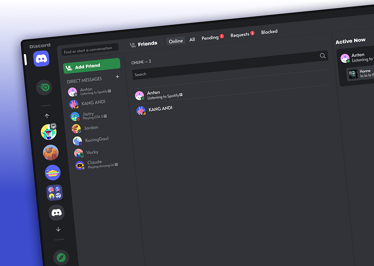
Simplified Layout - Discord
Problems
The current Discord application, whether on desktop, cellphone or website, does not pay attention to one element of the Triad of UX Design. Where one of the superior features which is a source of company income is placed in a less strategic place. Nitro is placed in the friends list tab. Even though it is displayed when you first open the application (desktop), users rarely touch or see it because it is located in the "Direct Message" feature group so the main goal of users there is to view their friendships.
Solution
I took the Nitro feature out of the friendship or “Direct Message” page and put it parallel to the server list, in the main menu. So now wherever the page the user goes to, this Nitro feature can always be displayed.
Apart from that, I included a “shop” feature on the “Nitro” page. Because "shop" is a feature similar to "Nitro" and there are special benefits such as special discounts if we subscribe to "Nitro" and buy items at the "shop"


