H•E•B Logo Re-design Proposal
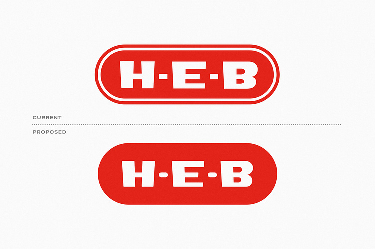
H-E-B is one of the largest grocery store chains in Texas. This is a proposed re-design of the logo.
For this update, I removed the outer line to simplify, rounded the dashes to match the container, and used the same curves to re-make the letter B.
Do you think it's an improvement?