Pillar Logo
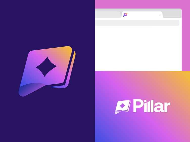
We worked on some finishing touches for the logo for Pillar. There was much consideration and contemplation that went into this creation process, and there were a few close 2nd’s, but when the right design comes forward, you just know that it’s the one. That’s how we and the team at Pillar feel about the new logo we recently finished for them. We crafted this beautiful logo utilizing elements that we adopted directly from the brand book we created for Pillar. The logo symbol itself demonstrates imagery such as a wallet, money, and creatively shapes out to look like a P for Pillar. The two L’s in Pillar conveniently stand together and were created to look like pillars. Utilizing pillars in the typography of the logo allowed for us to create a logo symbol that is separate from a “pillar” concept, and is more focused on the brands specific voice. The futuristic feel of the design speaks to the AI component which Pillar incorporates into their product. This final logo looks incredible by itself, on the website, on mobile, as a favicon, and anywhere else we’ve experimented with it!
We’re over the moon about this design and our partnership with Pillar. Scroll through our Dribbble and IG to see more of our creative projects with Pillar!
