Creative Ferry - Scaled
I am thrilled to showcase my latest UI/UX project: a comprehensive design of Creative Ferry's next evolution, a platform that bridges tech education and career development.
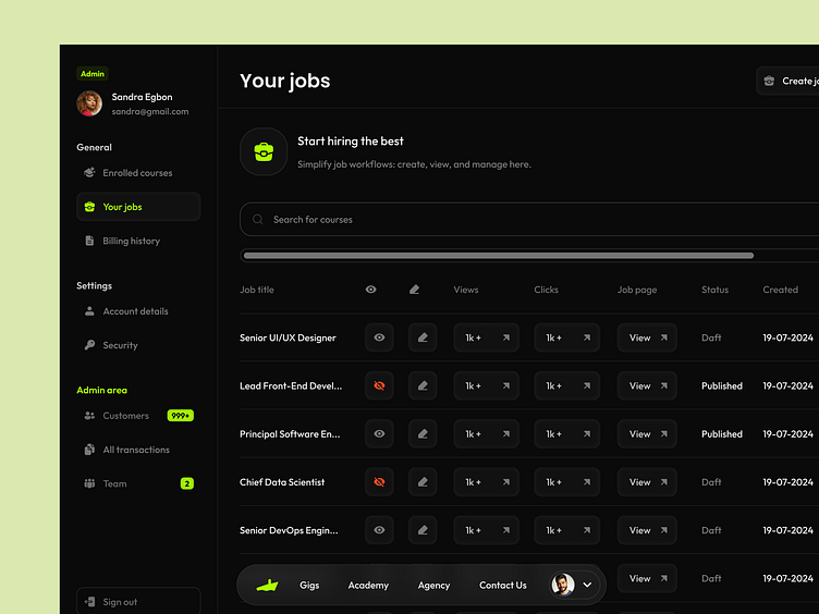
The centerpiece of this redesign is a powerful, intuitive dashboard. It serves as a command center for users, offering at-a-glance insights into course progress, job opportunities, and platform engagement. The dashboard's modular design allows for easy customization, ensuring that each user's most relevant information is always front and center.
Key features of the new UI include:
- A streamlined job listing feed integrated directly into the dashboard
- An efficient job posting interface for employers
- A visually engaging course tracker
- Customizable user profiles to showcase skills and portfolios
- A clear transaction history section
- Role management system for Creative Ferry's internal team
The role management feature was a particularly interesting challenge. It required creating an interface that could handle complex permissions and responsibilities while remaining user-friendly. The result is a flexible system that allows Creative Ferry to efficiently manage their team's access and capabilities within the platform.
Throughout the design process, I focused on maintaining a clean, modern aesthetic that guides users intuitively through their learning and career journey. The color palette, typography, and iconography were carefully chosen to create a cohesive visual language that aligns with Creative Ferry's brand identity.
In conclusion
This project presented an exciting opportunity to blend educational technology with career development tools and internal management systems. The result is a multifaceted platform that serves learners, employers, and the Creative Ferry team alike.
I'd love to hear your thoughts on this redesign. How do you think this UI balances the needs of multiple user types while maintaining a streamlined user experience?


