MOOSSE
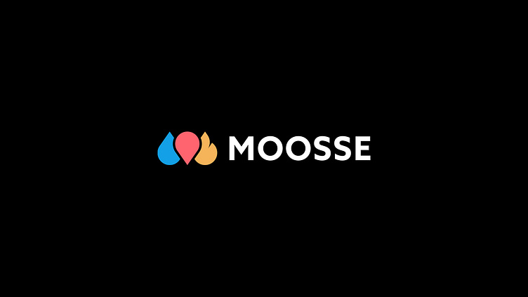
Logo design for a portable sauna service. The logo was inspired by a droplet, a location pin and a subtle flame. Together they overlap and form an M of Moosse. As with sauna's bringing water and heat together creates the steam. The location pin is placed in the middle for symmetry and because that is where water/fire come together.
More by Mart Biemans View profile
Like
